
Building Apple’s Digital Platform – My Journey as a UX/UI Designer
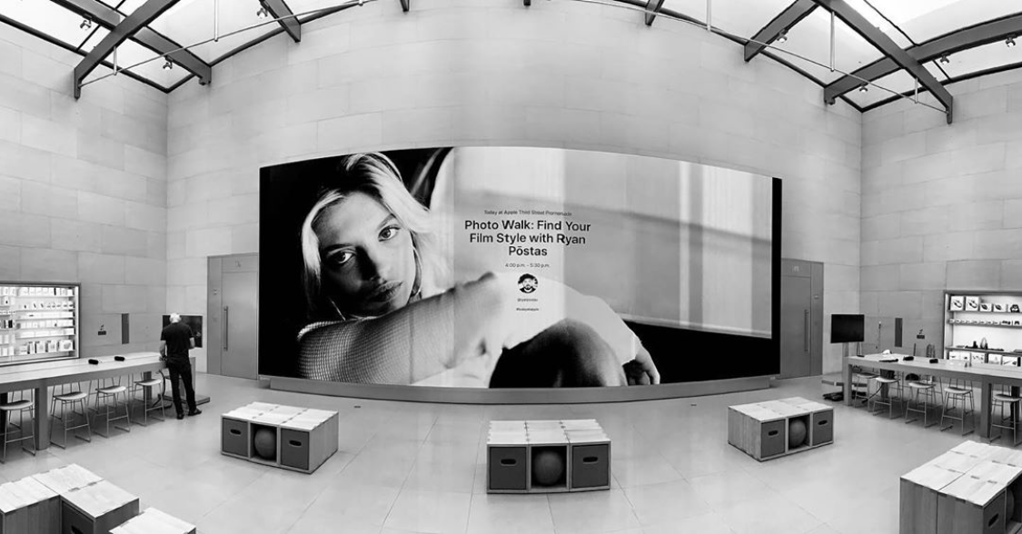
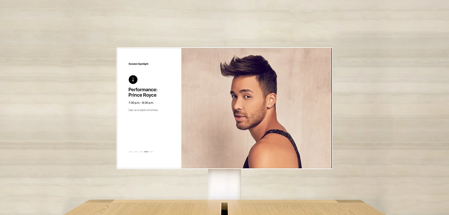
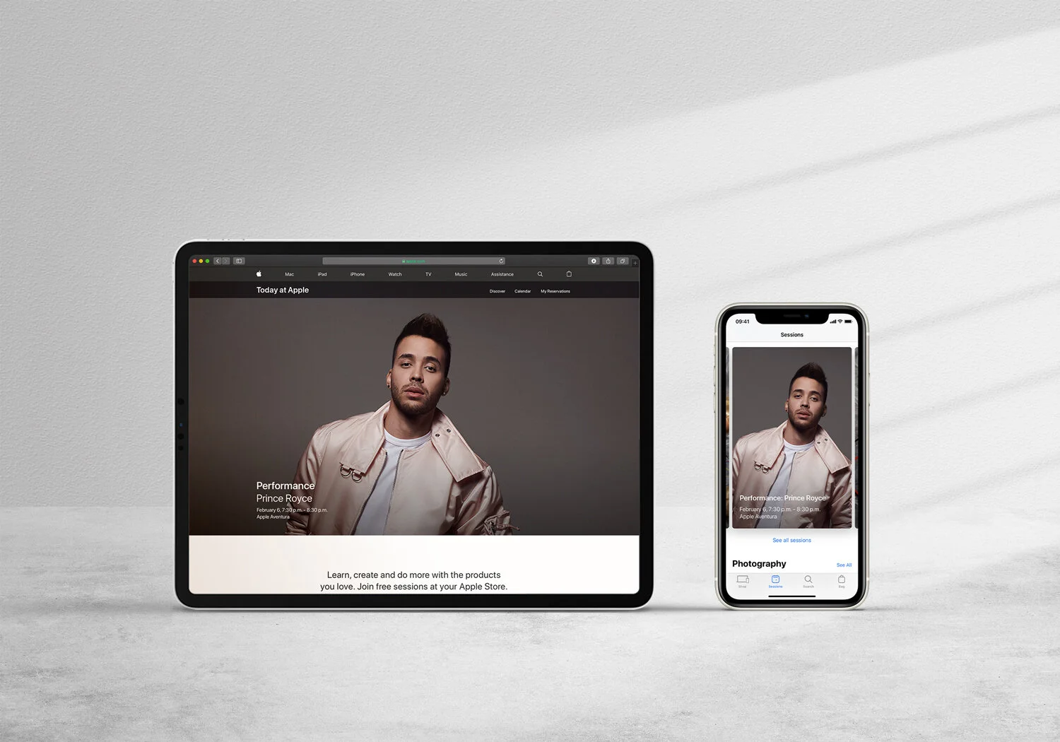
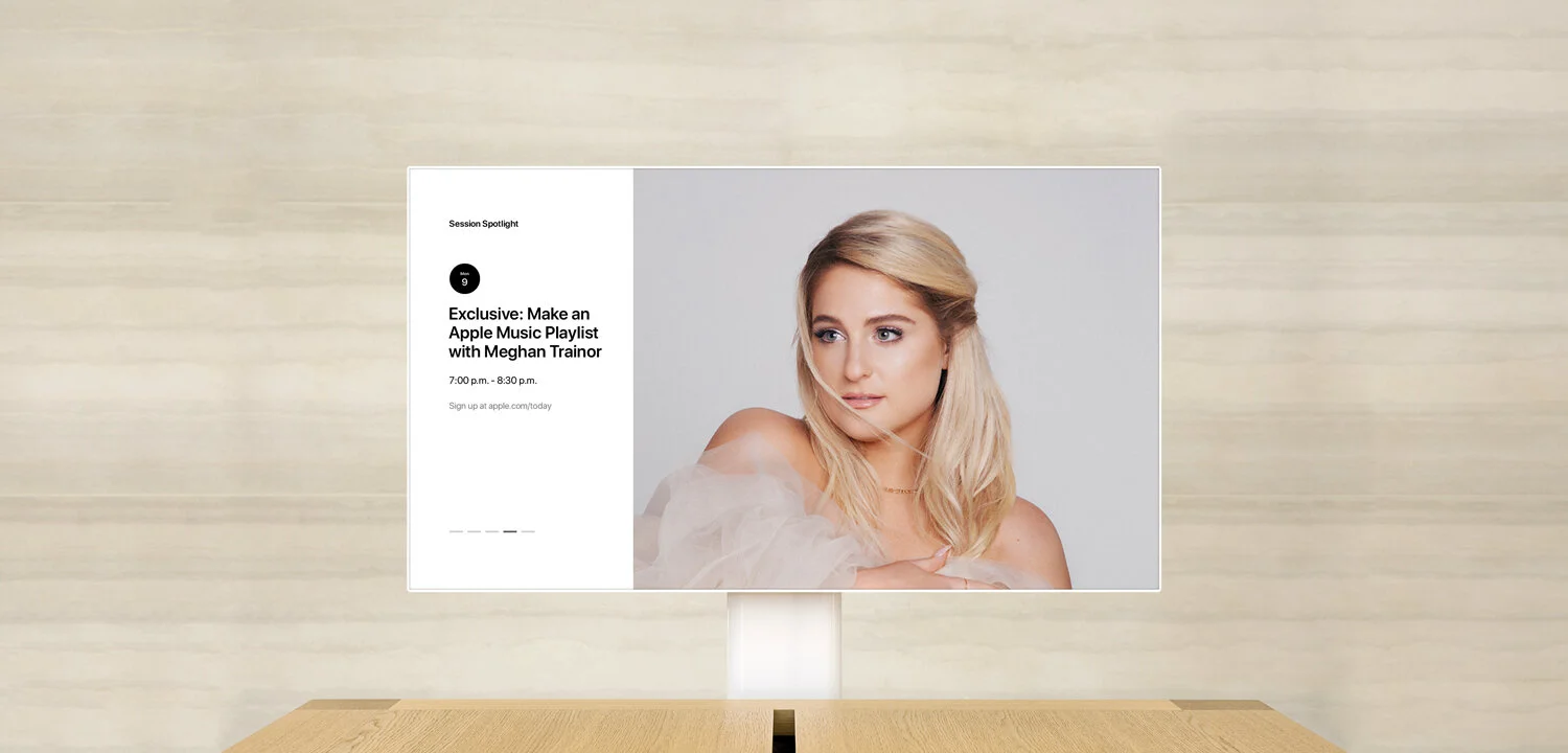
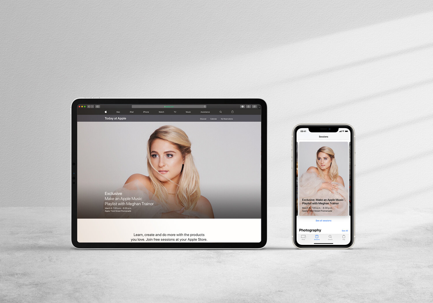
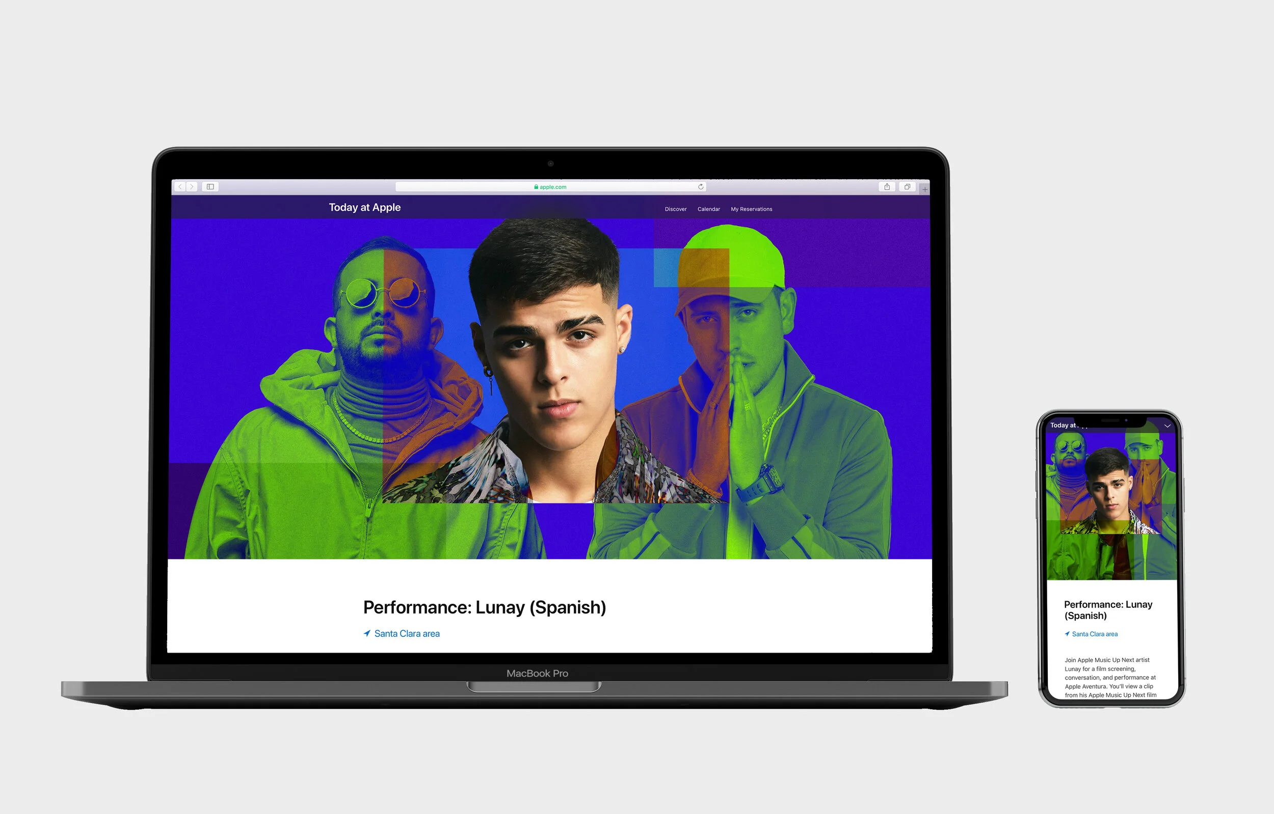
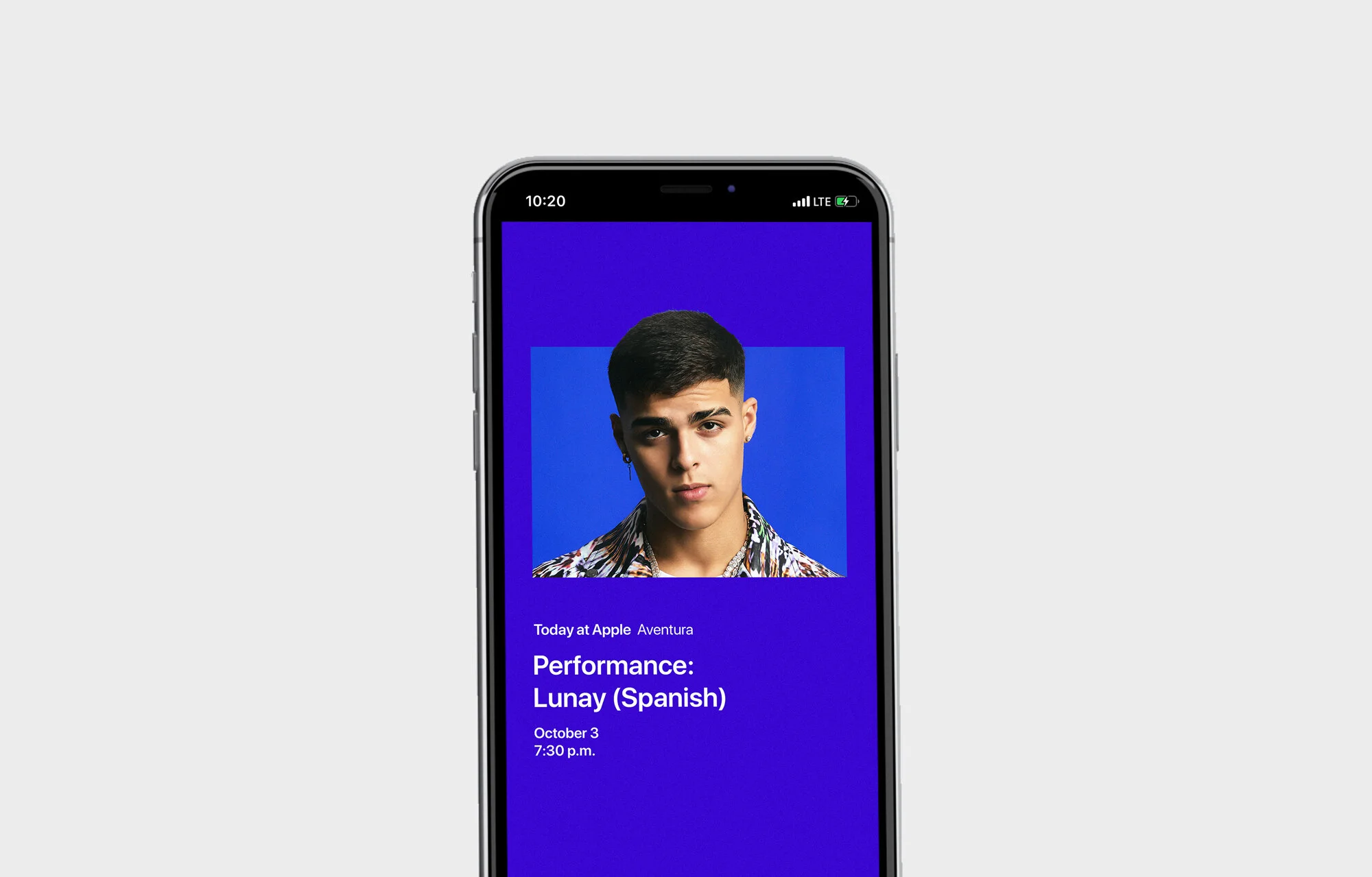
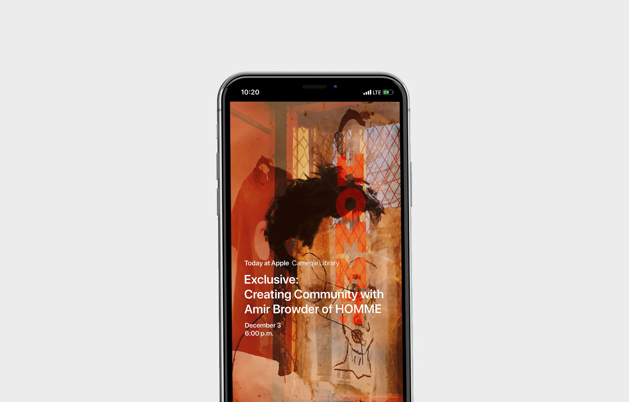
Apple embarked on a mission to redefine its retail experience, transforming it from a transactional space into a platform for meaningful personal connections. As a UX/UI Designer at Apple, I was part of this incredible journey to build a new digital platform from the ground up. Collaborating closely with our marketing team, we aimed to create a cohesive strategy that not only showcased our innovative products but also offered experiences that could change people’s lives. “Today at Apple” became a cornerstone of this vision, promoted prominently on Apple’s landing page, through personalized email campaigns, and amplified by comprehensive marketing efforts.
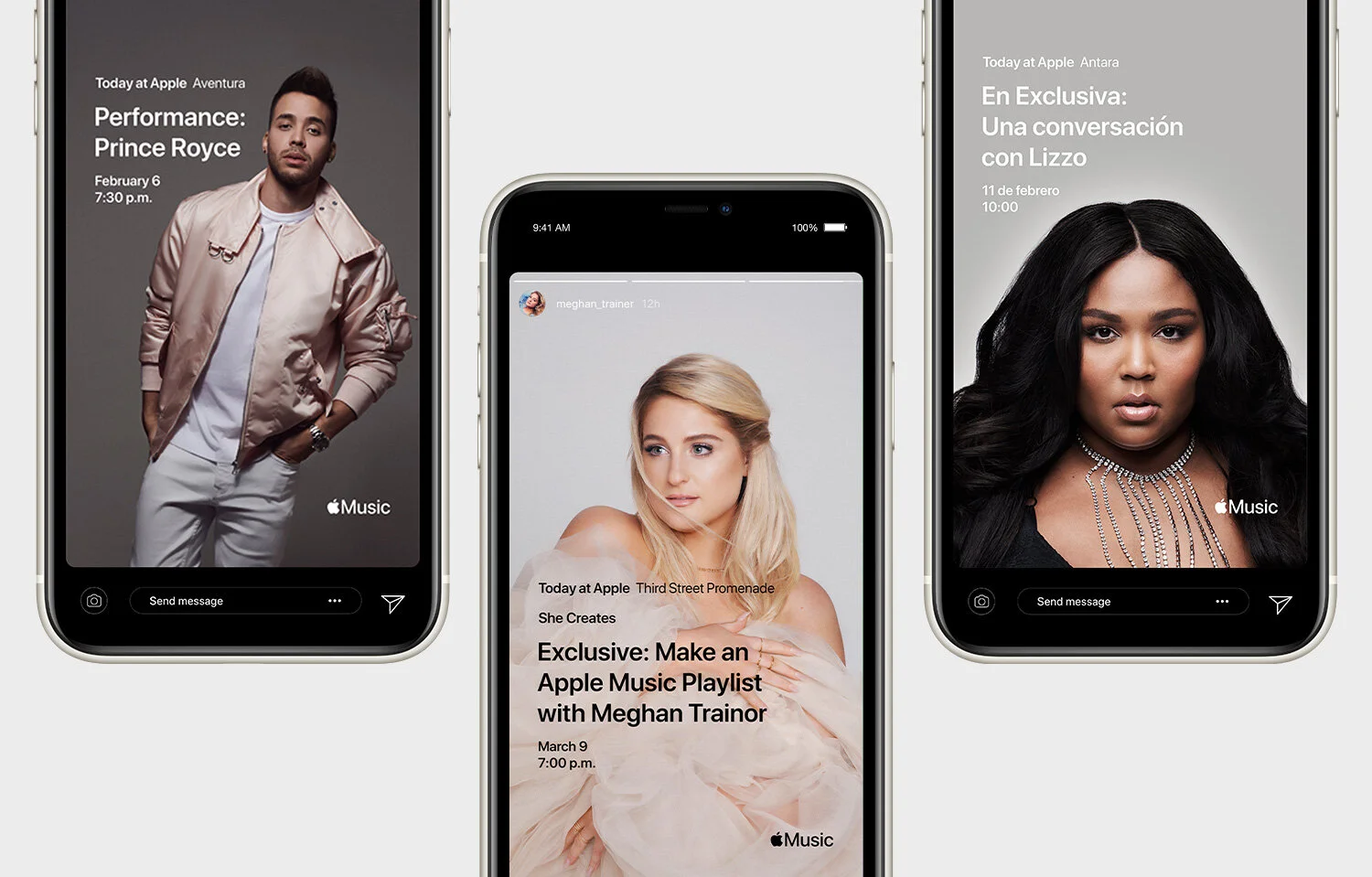
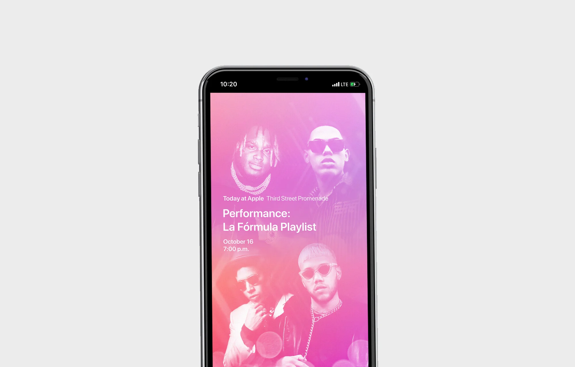
Project Goals
Create an Innovative Digital Platform
Develop a platform that embodies Apple’s brand values of simplicity, elegance, and user-centric design.Adopt a User-Centered Approach
Focus on the needs and behaviors of a diverse, global user base.Reimagine the Retail Experience
Transform Apple Stores from transaction-focused spaces into community hubs centered around education and creativity.Incorporate Collaborative Best Practices
Utilize effective collaboration strategies to enhance the design and development process.Ensure Accessibility and Inclusivity
Make the platform accessible to all users, reflecting Apple’s commitment to inclusivity.
Design Challenges
Defining a Unique Digital Identity
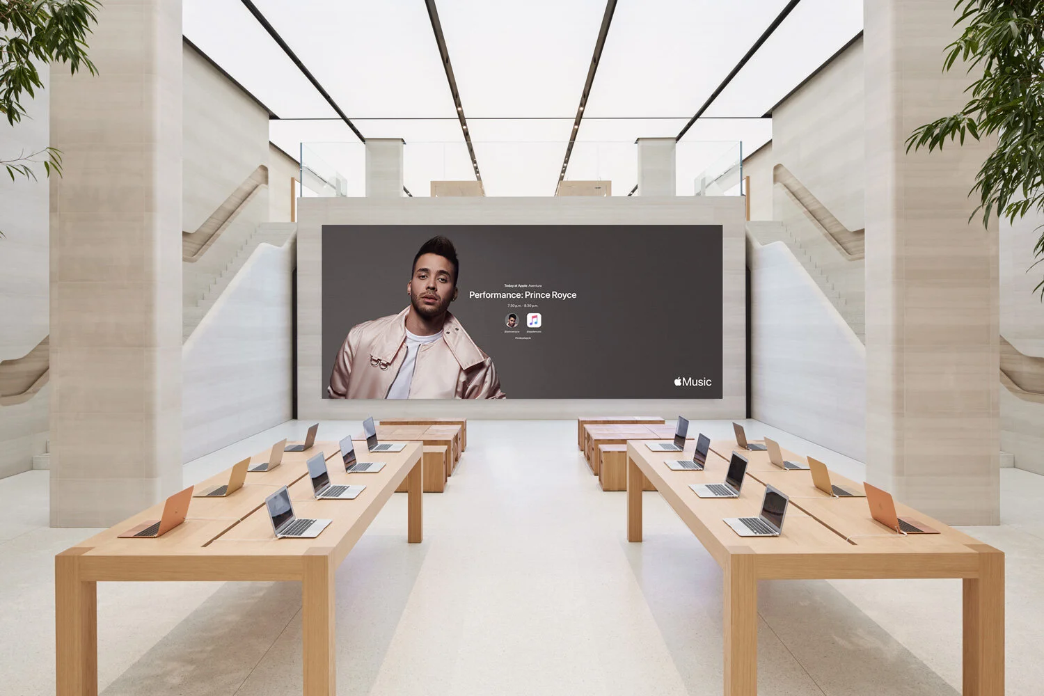
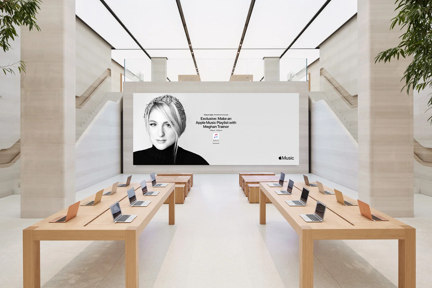
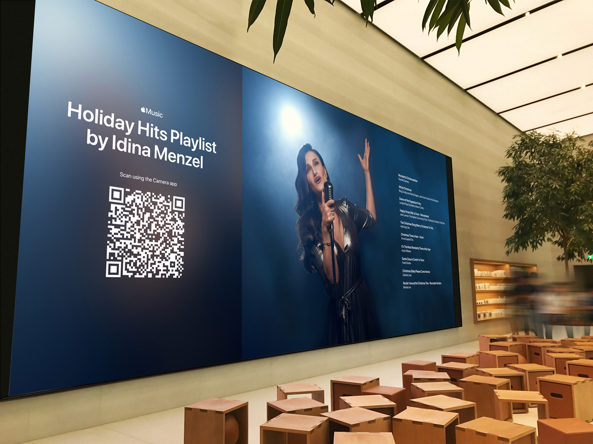
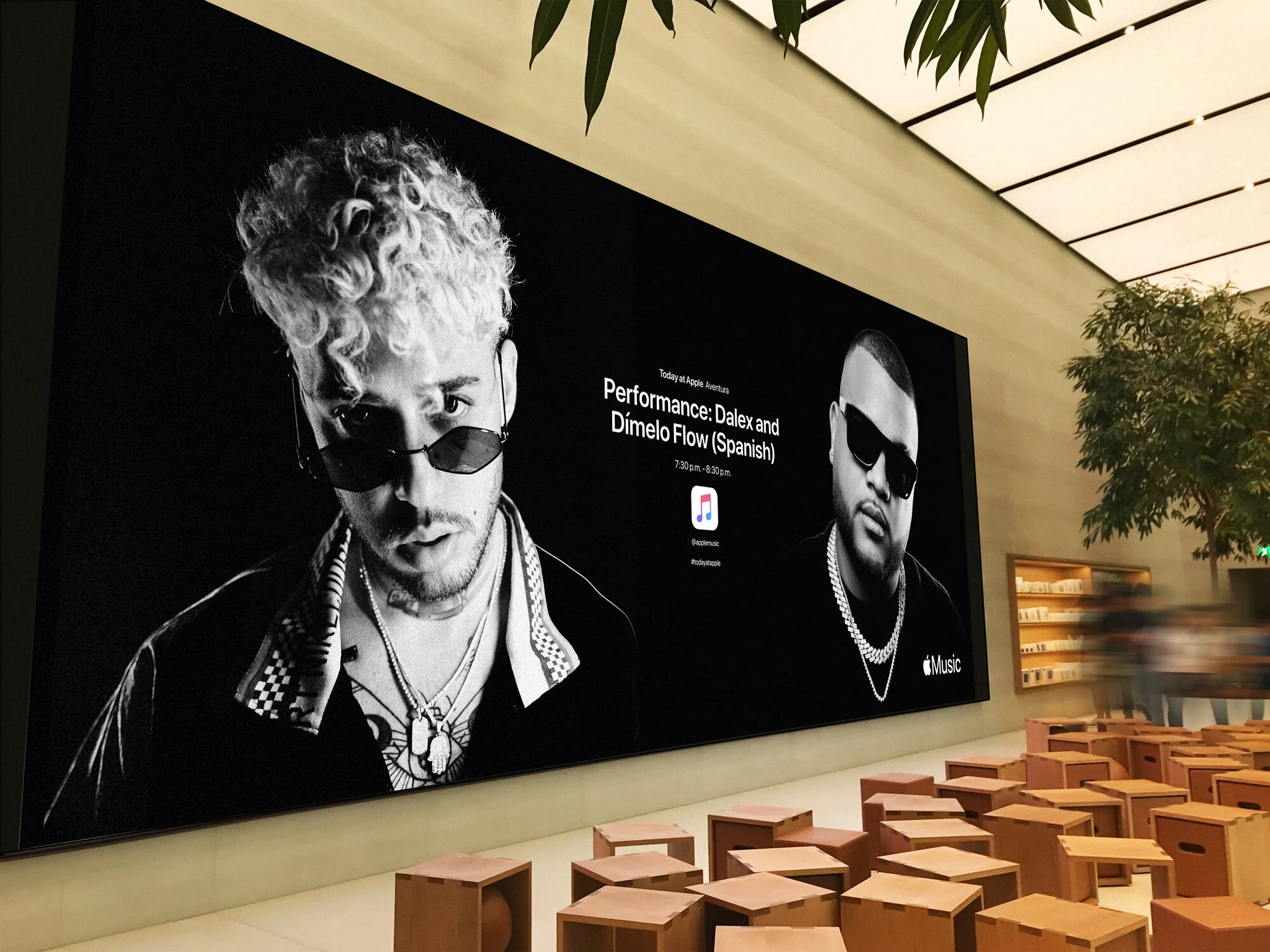
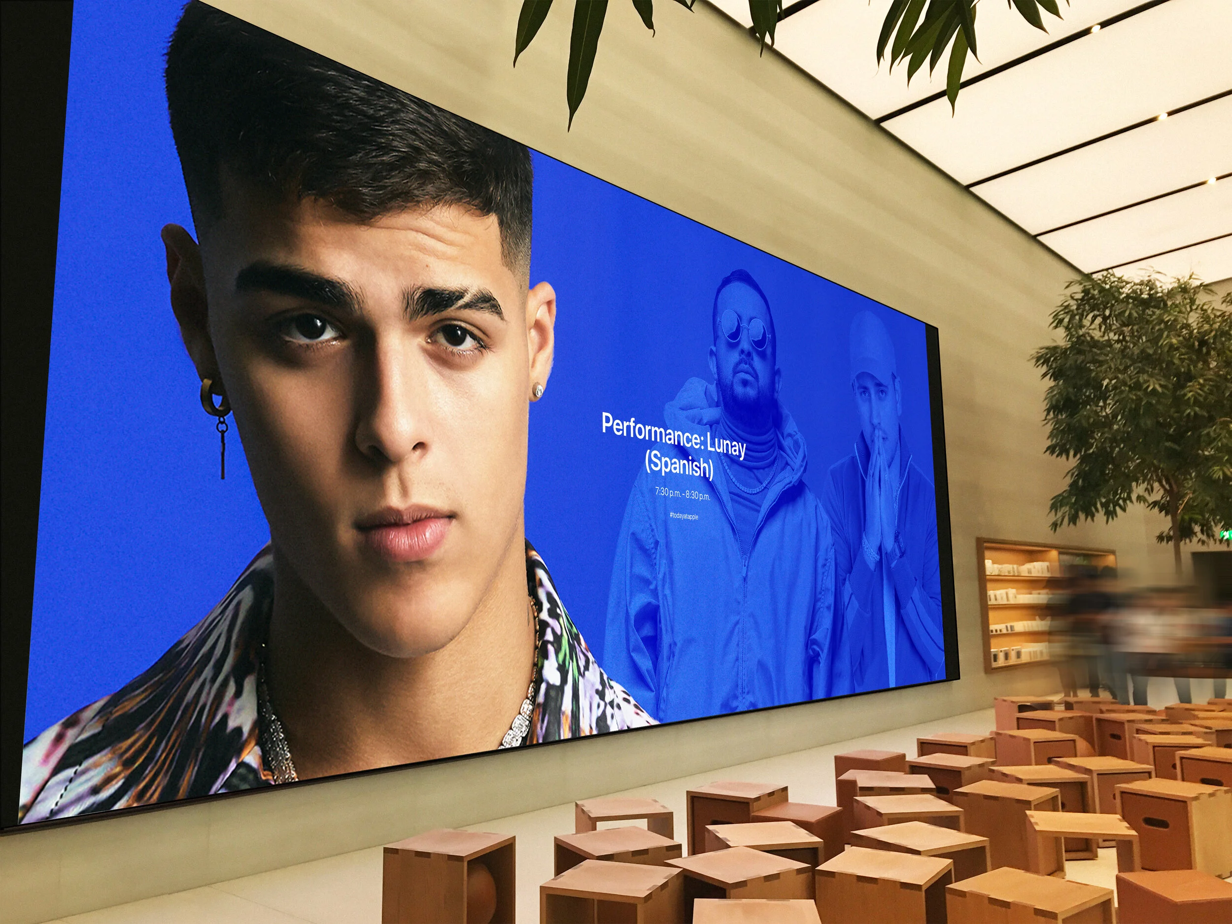
Crafting a fresh design that aligns with Apple’s established brand while introducing innovative elements.Custom 6K Video Walls
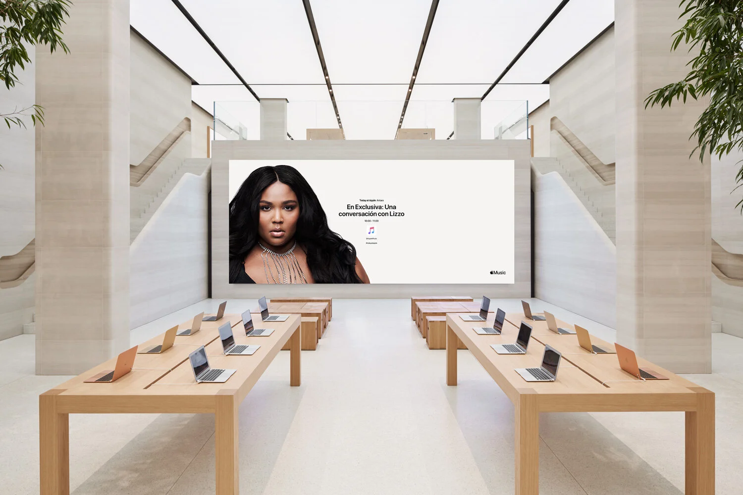
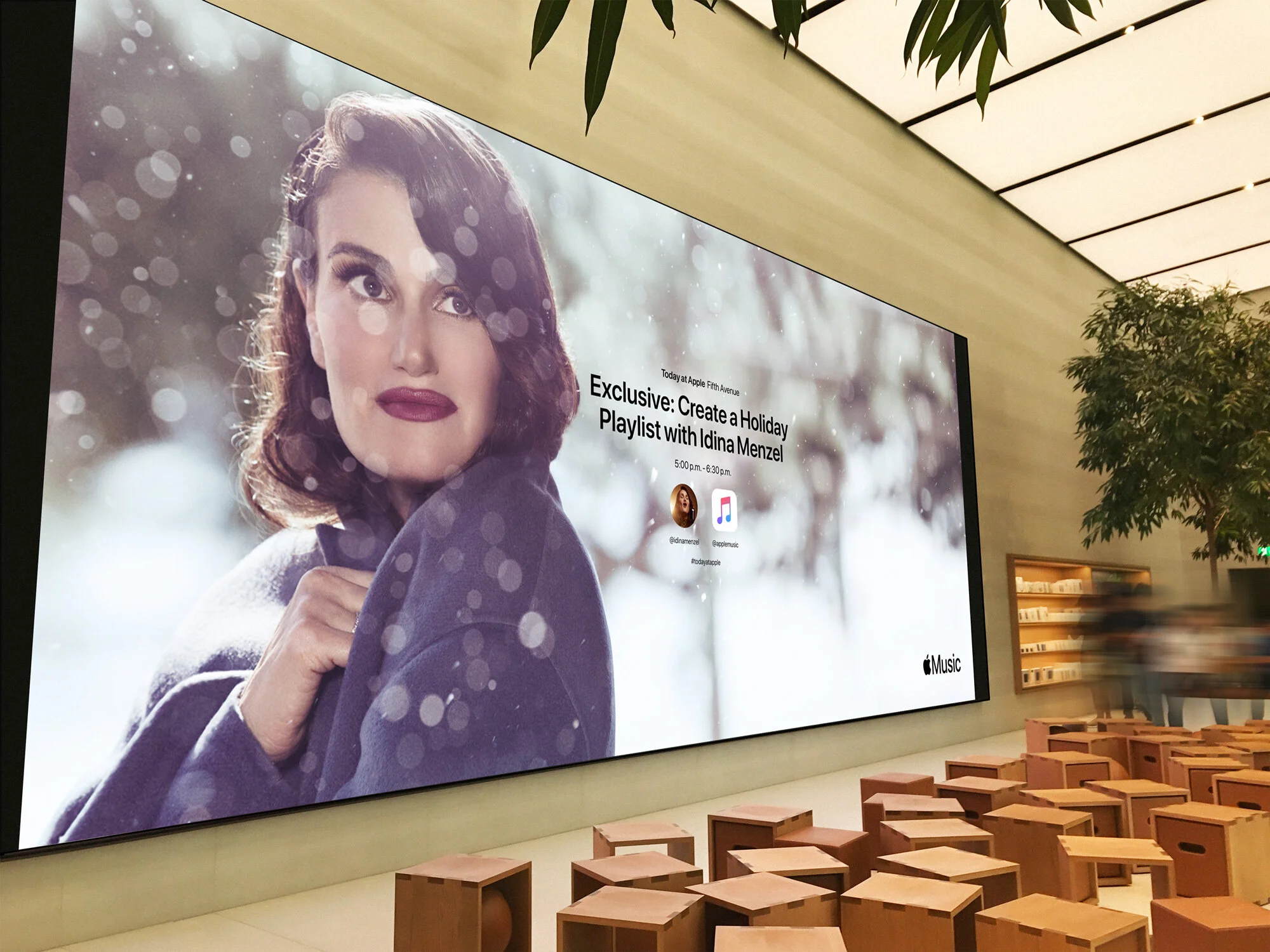
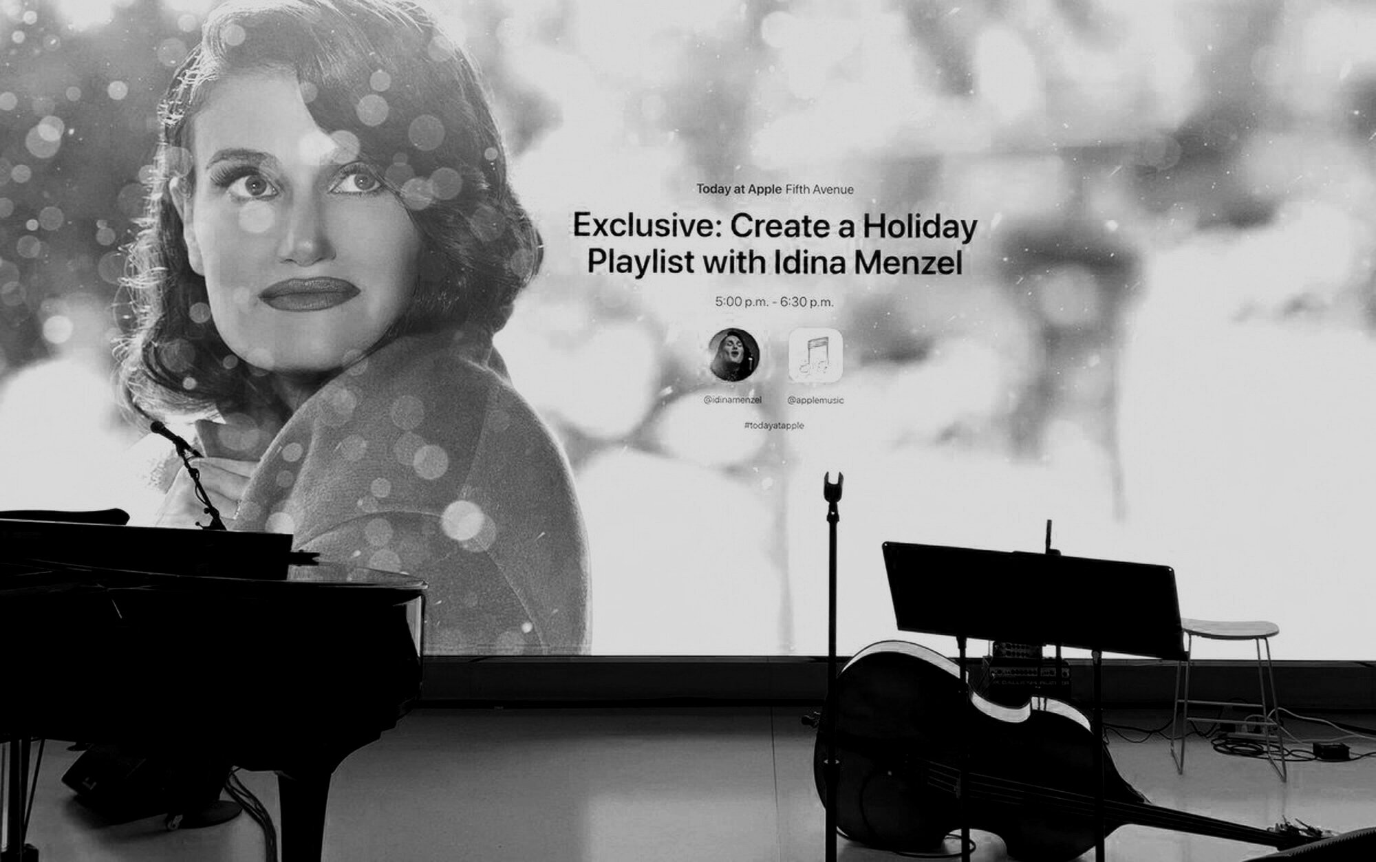
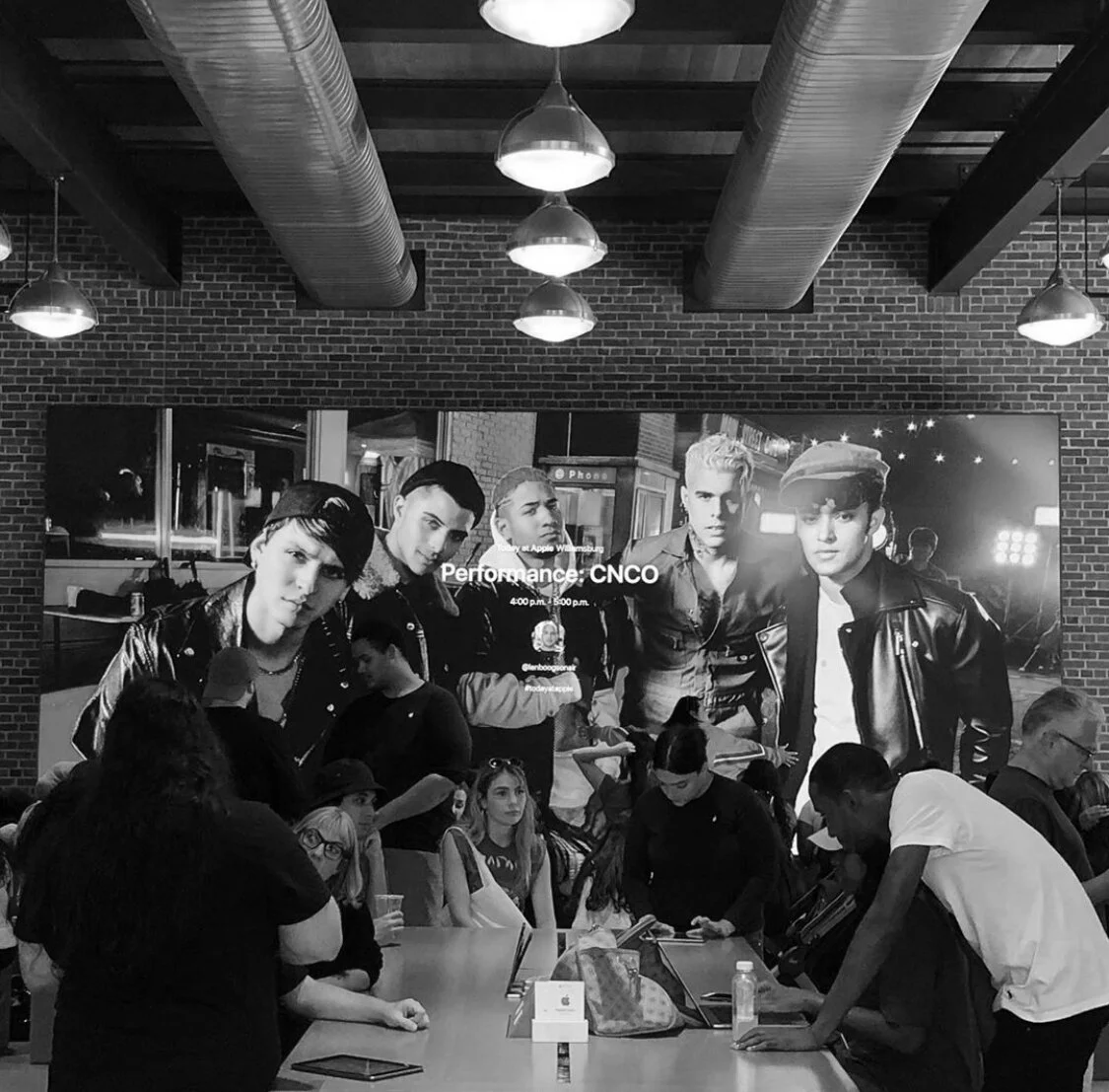
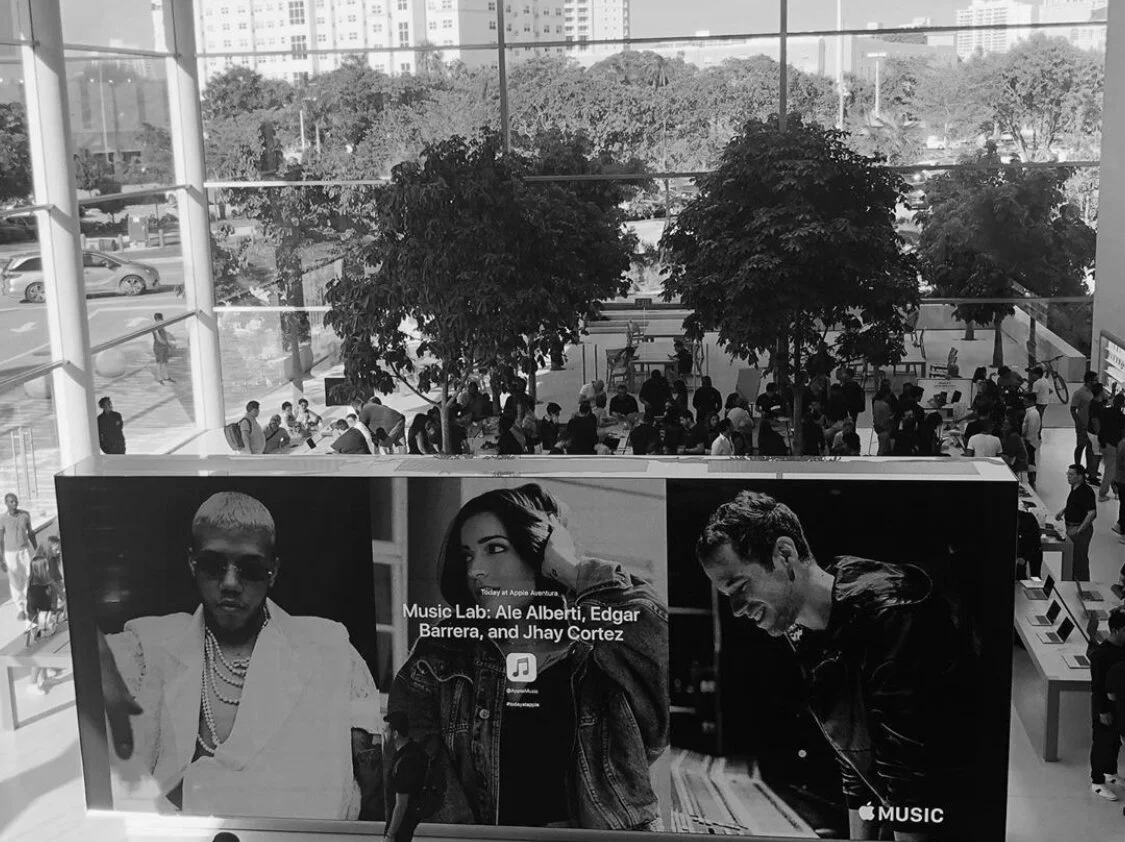
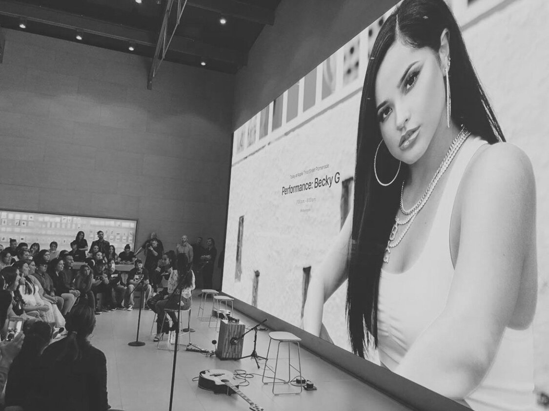
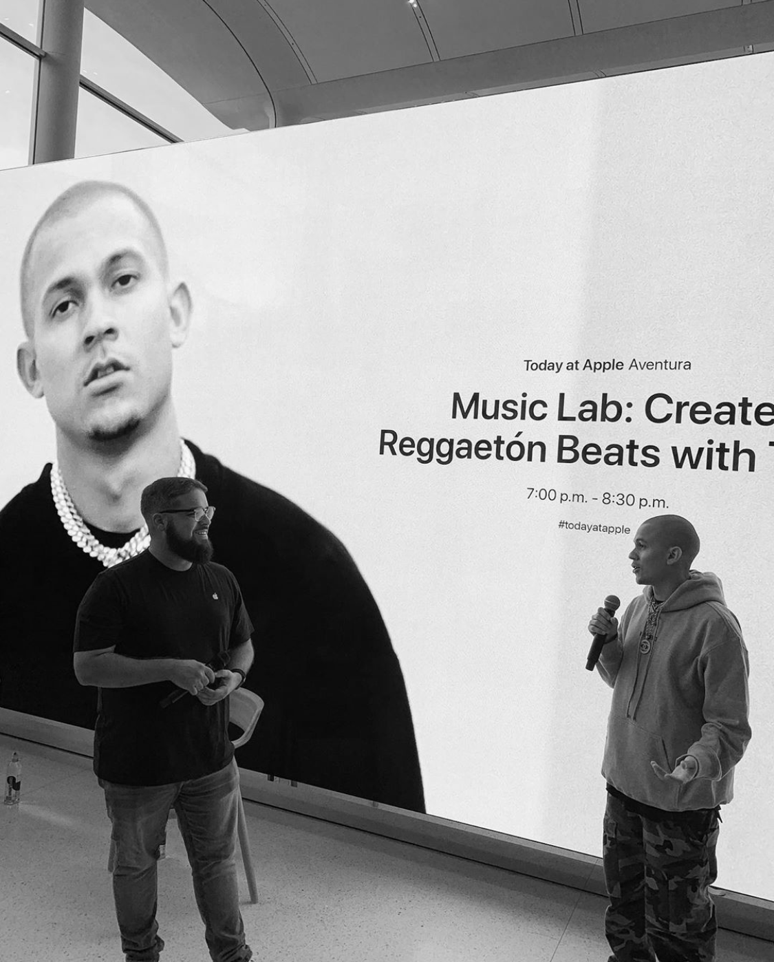
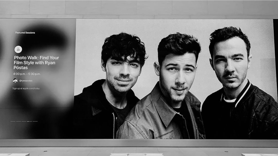
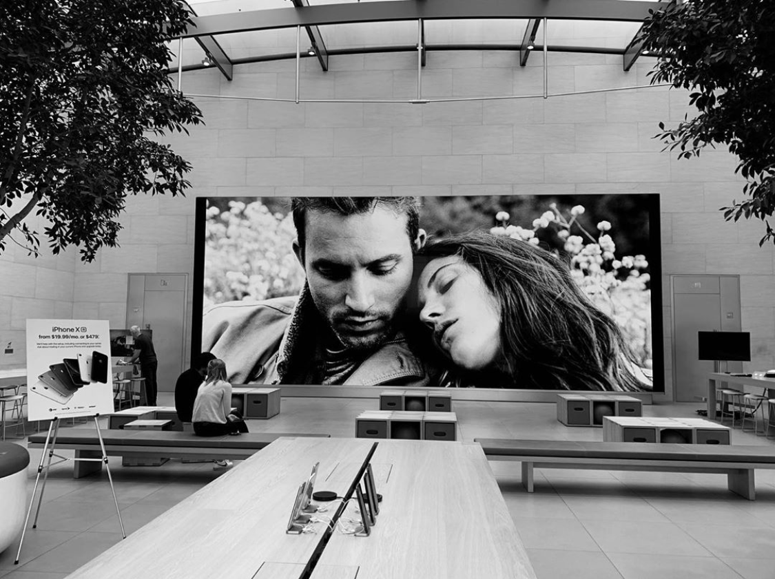
Integrating multiple giant screens—some as large as 34 feet wide—that are synchronized with software, serving as the heart of the Today at Apple retail experience.Meeting High User Expectations
Satisfying a global audience that expects excellence from Apple.Integrating Collaborative Insights
Leveraging cross-functional collaboration to enrich the design.Planning for Scalability
Designing a platform that can evolve with future technological advancements.

User Journey
Name: Alex
Age: 28
Occupation: Aspiring Photographer
Tech Savvy Level: High
Goal: To find and register for a photography session at a nearby Apple Store.
-
Trigger Event: Alex sees a social media post about free creative sessions at Apple Stores.
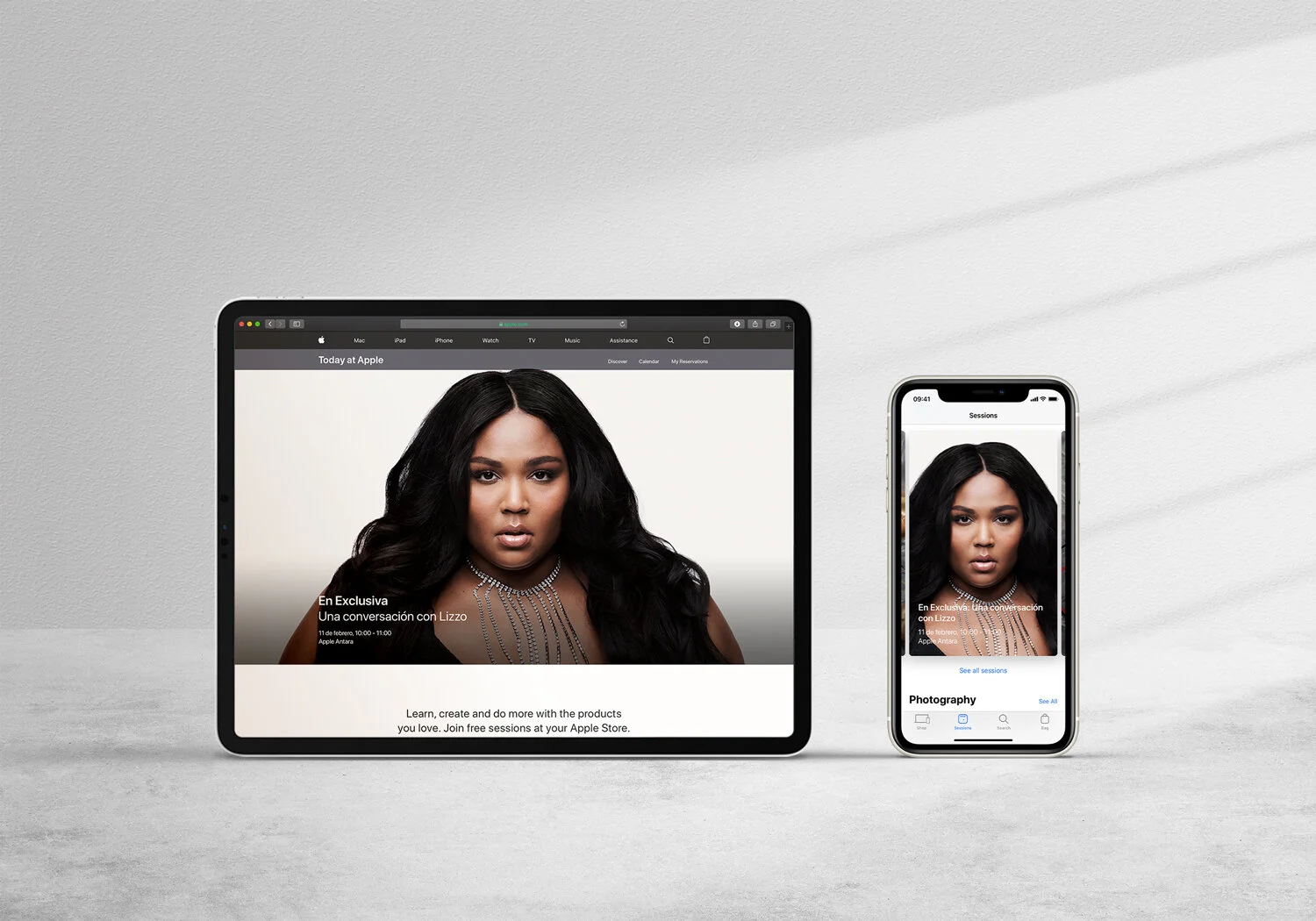
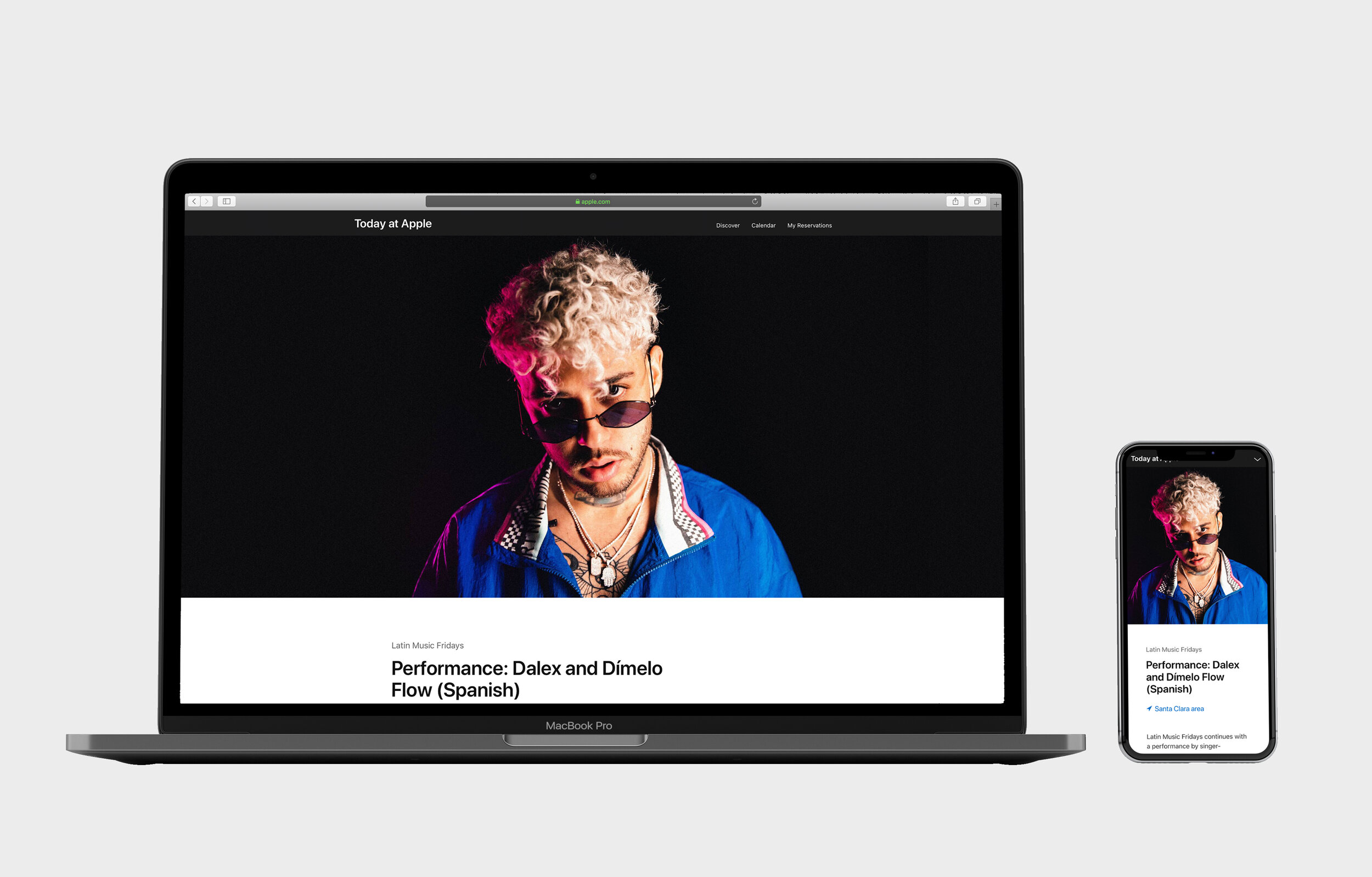
Action: Clicks on the link, which leads to the Today at Apple webpage.
-
First Impression: The page features vibrant images showcasing various sessions (Photography, Music, Art & Design, etc.).
Navigation Bar: At the top, options like “Browse Sessions,” “Find a Store,” and a search icon are visible.
-
Scrolling Down: Alex scrolls to see featured sessions and upcoming events.
Session Categories: Notices categories like “Photo Skills,” “Video Lab,” and “Kids Hour.”
Engagement: A short video auto-plays, highlighting the experience of attending a session.
-
Filter Options: Alex clicks on “Browse Sessions” to apply filters.
Location: Enters their city or allows location access.
Date: Selects preferred dates.
Category: Chooses “Photography.”
Results: A list of relevant sessions appears.
-
Session Details: Clicks on “Photo Skills: Editing Techniques.”
Description: Reads about what the session covers.
Duration: Notes the session lasts 60 minutes.
Requirements: Sees that an iPhone is recommended but devices are available if needed.
Images & Reviews: Views photos from past sessions and reads attendee feedback.
-
Sign Up: Clicks the “Register” button.
Apple ID Login: Prompted to sign in; Alex enters credentials.
Confirmation Page: Confirms the session details and sees an option to add to their calendar.
Email Confirmation: Receives a confirmation email with all the details and a QR code for check-in.
-
Reminder Notifications: Gets a push notification a day before the session.
Preparation Tips: Email suggests apps to download or settings to adjust for the best experience.
-
Arrival: Alex arrives at the Apple Store, where signage directs them to the session area.
Check-In: Shows the QR code to an Apple representative.
Experience: Participates in the session, engages with the instructor, and networks with other attendees.
-
Follow-Up Email: Receives materials covered in the session and links to related tutorials.
Feedback Request: Asked to fill out a survey about their experience.
Future Sessions: Based on interests, suggested upcoming sessions are listed.
-
Social Sharing: Alex shares photos from the session on social media using #TodayatApple.
Community Interaction: Joins an online forum or Apple community group for photography enthusiasts.
Touchpoints and Channels
Website: Primary platform for discovering and registering for sessions.
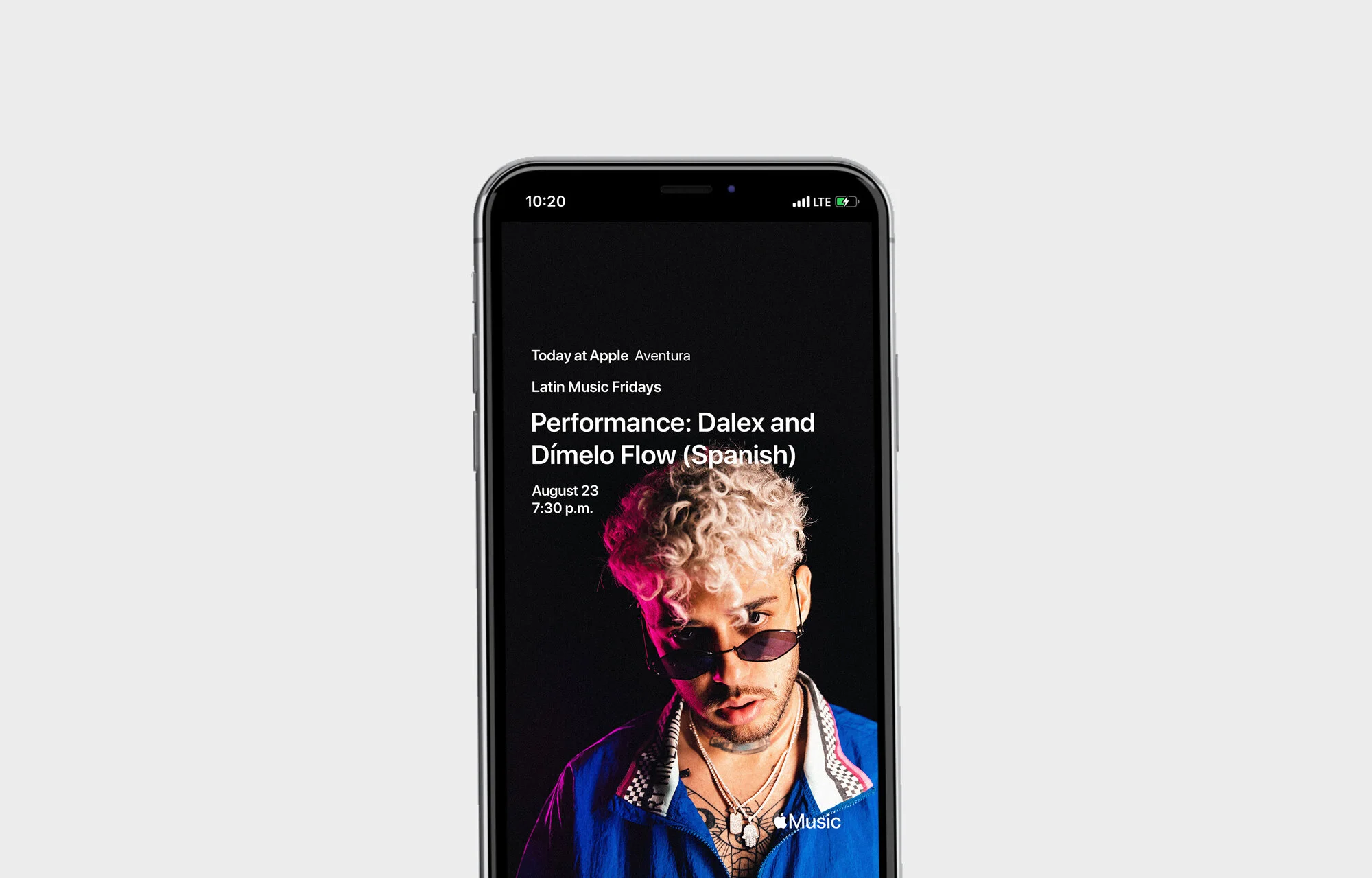
Email: Used for confirmations, reminders, and follow-ups.
In-Store Experience: Physical attendance and interaction.
Mobile Notifications: Reminders and updates via the Apple Store app.
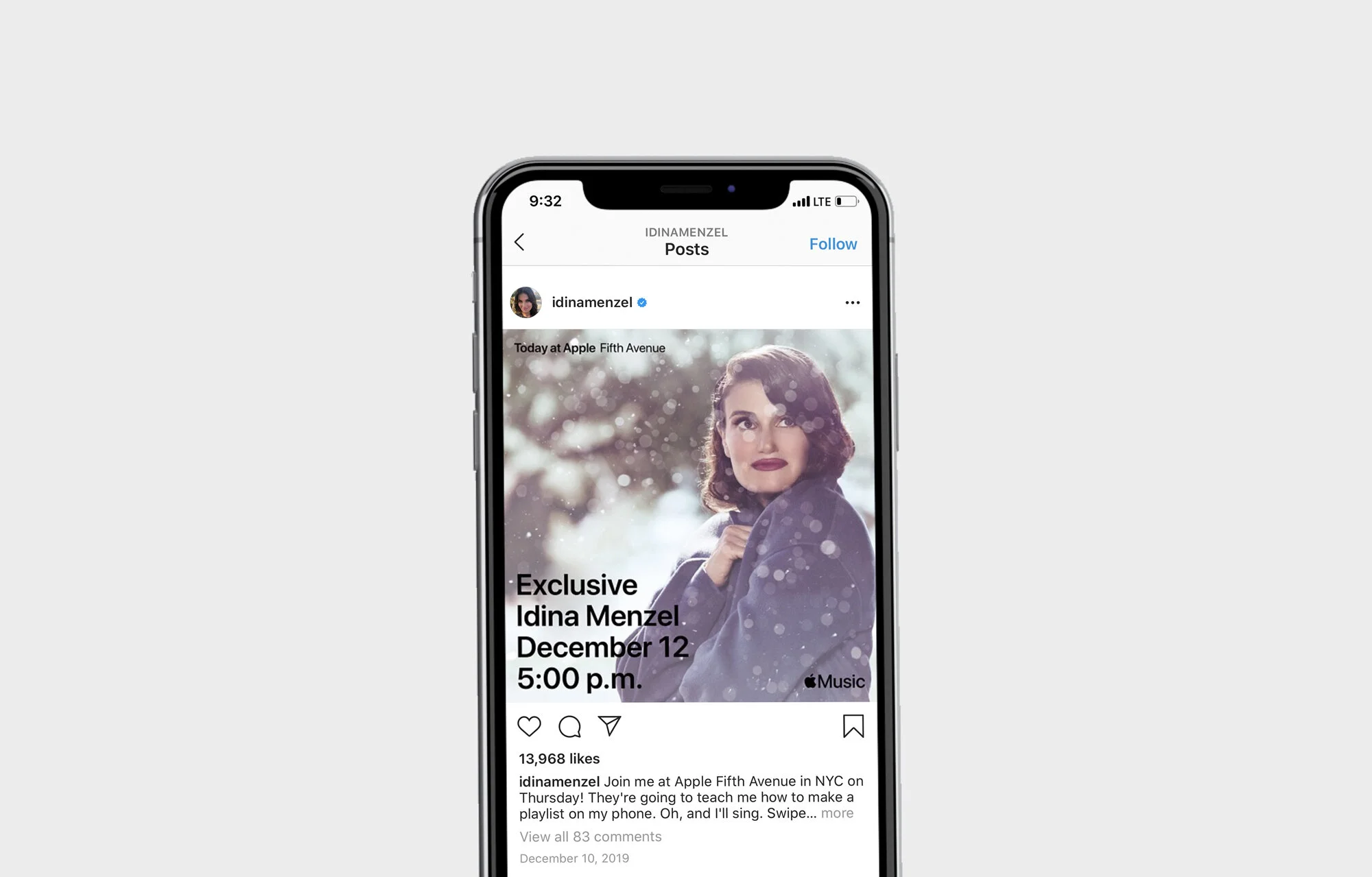
Social Media: Awareness and post-event sharing.
Pain Points & Solutions
Pain Point: Overwhelmed by session options.
Solution: Implement personalized recommendations based on browsing history or Apple ID data.
Pain Point: Uncertainty about device requirements.
Solution: Clearly state what’s needed and offer device loans prominently in session details.
Opportunities for Enhancement
Virtual Sessions: Offer online versions for those unable to attend in person.
Group Registrations: Allow users to sign up with friends easily.
Loyalty Rewards: Introduce a rewards program for attending multiple sessions.
My Design Approach
1. Embracing Collaboration
I prioritized collaboration by facilitating workshops and brainstorming sessions with cross-functional teams, including developers, content strategists, and marketing professionals. Together, we devised a strategy to help people pursue their passions. This collective approach ensured that diverse perspectives were considered, leading to a more holistic design.
2. Reimagining the Retail Experience
Apple saw an opportunity to evolve its stores from being solely focused on transactions to becoming community hubs with education and creativity at the center. We wanted people to visit Apple Stores to:
Attend live performances with bands and musicians.
Learn drawing skills from influential artists.
Collaborate with startups and entrepreneurs.
Send their kids to Apple Store camps for filmmaking and coding.
Go on guided walks with professional photographers to learn new camera skills.
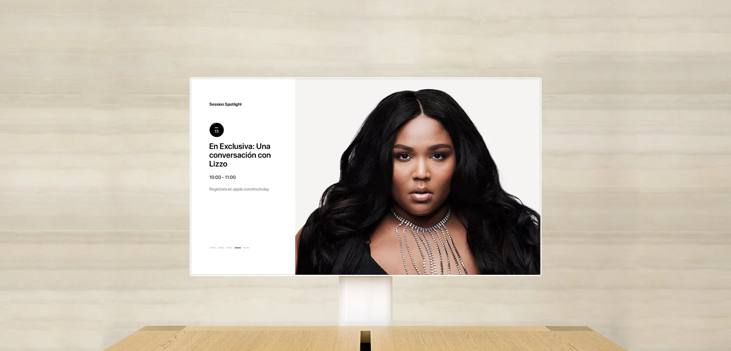
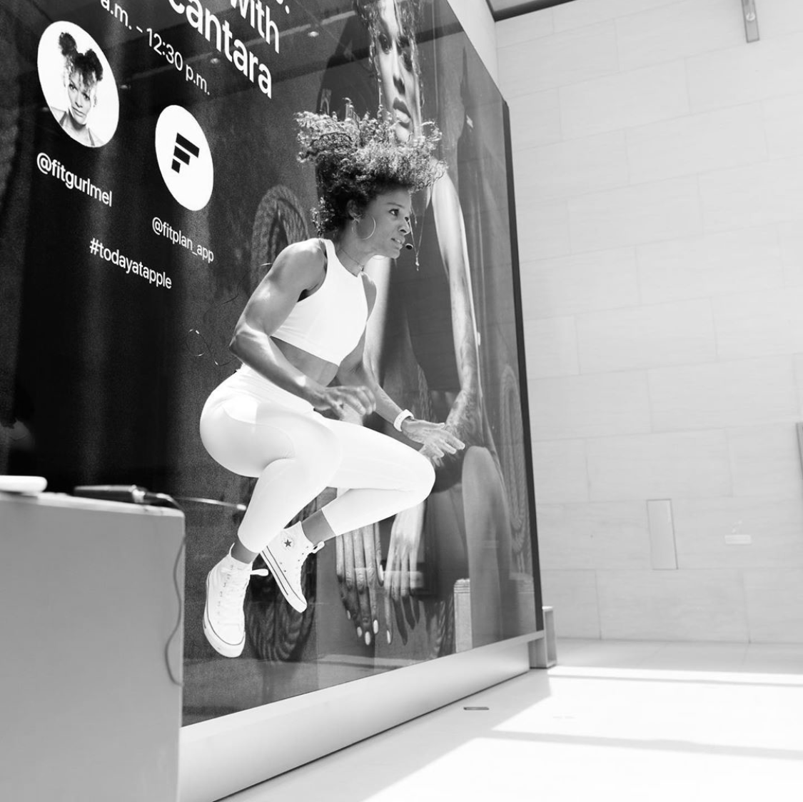
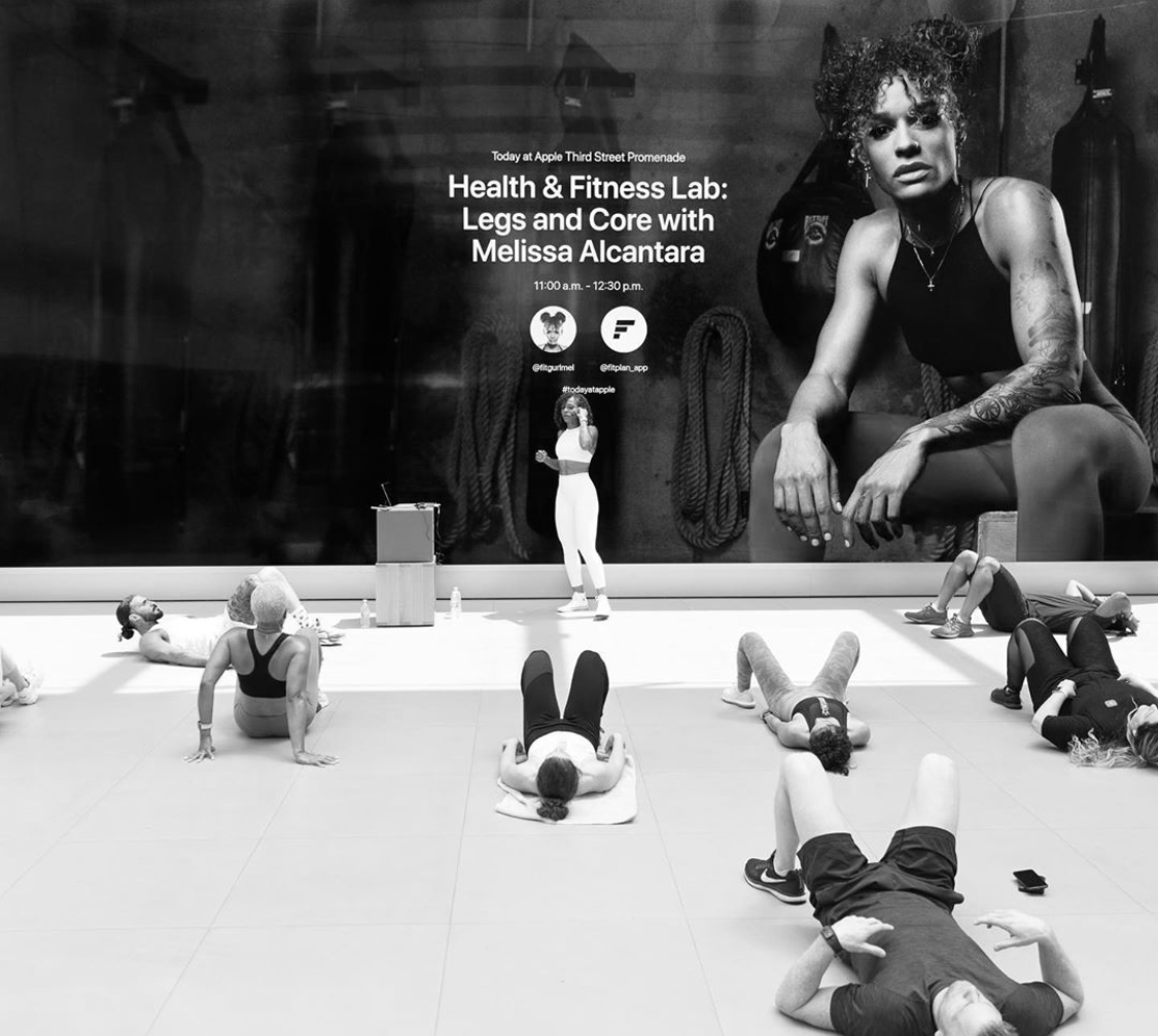
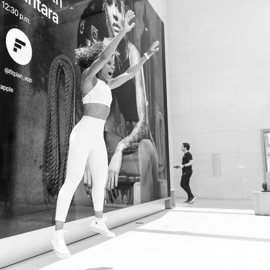
To facilitate these learning sessions, we designed and developed new software inside stores—from content management systems powering massive video walls to forum displays for intimate sessions.
3. Tackling the Video Wall Challenge
The custom 6K video walls presented a challenge at a new scale, requiring months of prototyping. These video walls are synchronized with software and are central to the Today at Apple experience. Because stores have varying video wall dimensions, we needed to create responsive designs for ultra-large screens to ensure each mode worked across every video wall in every store.
I led the design and development of the content and display modes, as well as the creation of a new publishing tool. This required close collaboration with engineers and content teams to manage the technical complexities and deliver a seamless visual experience.
4. User Research and Insights
I conducted extensive user research to understand our audience’s needs, preferences, and pain points. Surveys, interviews, and usability tests provided valuable insights that informed design decisions. Understanding how users interacted with existing platforms helped identify opportunities for improvement.
5. Iterative Design and Testing
Adopting an agile workflow, I developed prototypes and wireframes that were continuously tested and refined. This iterative process allowed for quick adjustments based on feedback, ensuring the final product was aligned with user expectations.
6. Crafting the Visual and Interactive Design
Visual Language
I established a clean, minimalist aesthetic consistent with Apple’s brand.
High-quality imagery and a consistent color palette enhanced the visual appeal.Typography
Selecting fonts that were both modern and highly readable was crucial.
The typography needed to reflect Apple’s design ethos while ensuring accessibility.Interaction Design
I incorporated intuitive navigation and interactive elements.
Micro-animations and responsive feedback made the user experience more engaging.
7. Focusing on Accessibility
Accessibility was a core consideration throughout the design process.
I ensured the platform met international accessibility standards by:
Providing alternative text for images.
Ensuring sufficient color contrast.
Making the platform navigable via keyboard.
Supporting screen readers.
Key Design Solutions
Establishing a Distinct Visual Identity
Creating a visual identity that was both fresh and aligned with Apple’s brand was essential. I focused on simplicity, using ample white space and a restrained color palette to let content shine.Enhancing User Engagement
By implementing personalized content recommendations and interactive elements, I aimed to keep users engaged. Features were designed to be intuitive, reducing the learning curve for new users.Optimizing for Performance
Understanding that performance impacts user experience, I optimized images and code to ensure fast load times. This approach helped maintain user engagement and satisfaction.

Outcomes and Impact
Successful Platform Launch
The platform was launched globally and received positive feedback from users and industry experts alike.Increased User Engagement
Metrics showed higher user retention rates, longer session durations, and increased interaction with content.Recognition for Innovation
The project set new benchmarks in UX/UI design within the industry.Strengthened Brand Loyalty
Users appreciated the seamless experience, reinforcing their connection to the Apple brand.Global Adoption of Today at Apple
The platform was successfully implemented in 495 stores globally, bringing the “Today at Apple” experience to customers worldwide.Award-Winning Recognition
The “Today at Apple” program achieved the highest honors at Cannes Lions, securing 1st Place with both the Titanium and Grand Prix awards, highlighting our innovation and impact in the industry.Enhanced Employee Engagement
We successfully onboarded 70,000 employees onto a single, personalized communication and task management platform, improving internal collaboration and efficiency.
Lessons Learned
The Power of Collaboration
Working closely with various teams enriched the design and ensured alignment with overall business goals.User-Centric Design is Crucial
Keeping the user’s needs at the forefront led to a more effective and appreciated platform.Importance of Accessibility
Prioritizing inclusivity not only met ethical standards but also expanded our user base.Continuous Improvement
An iterative design process allowed for flexibility and adaptation, leading to a better final product.
Conclusion
Designing Apple’s new digital platform from scratch was a challenging yet rewarding experience. By embracing collaboration, focusing on the user, and striving for innovation, I was able to contribute to a project that not only met but exceeded expectations. The successful global adoption, extensive program offerings, industry recognition, and enhanced employee engagement are testaments to the impact of thoughtful design. This journey reinforced my belief in the importance of empathy, teamwork, and dedication in creating exceptional user experiences.