
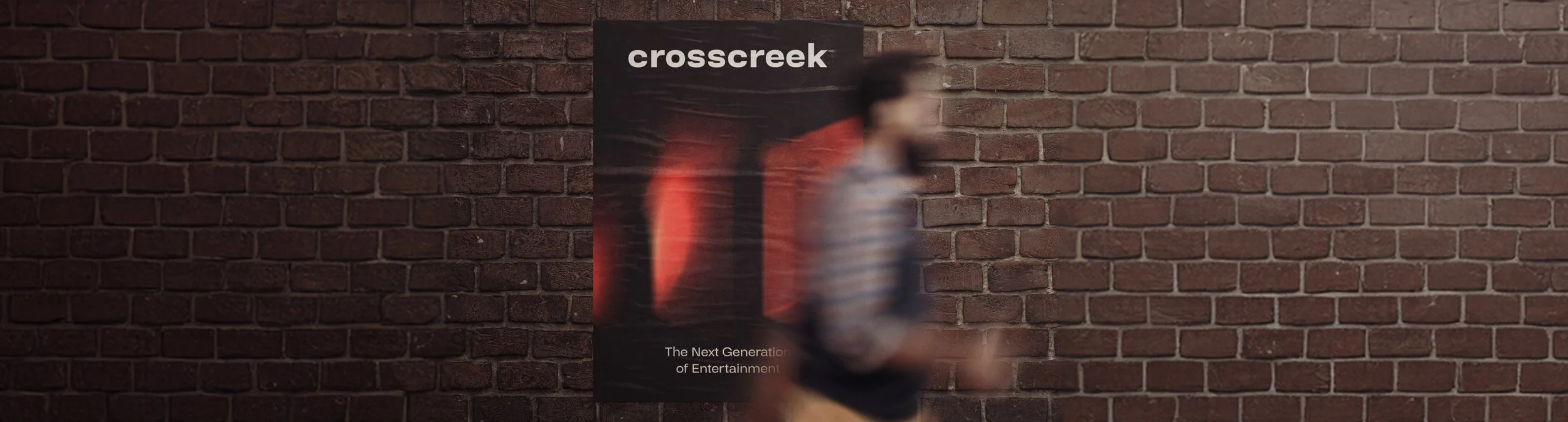
Cross Creek Logo Redesign
Cross Creek Pictures is a production company known for its involvement in critically acclaimed films. The company sought to refresh its visual identity to better align with its evolving brand and film portfolio. A new logo design process was initiated to modernize and streamline the visual representation of the company.
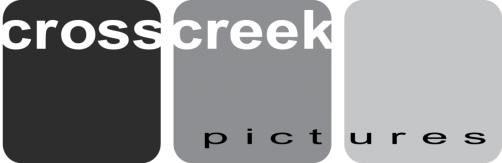
Original Logo Analysis
The original logo, featured in grayscale, is a minimalistic design with three solid vertical blocks transitioning from black to light gray. It communicates seriousness and classic appeal, but lacks flexibility for modern, digital-first branding.
Strengths
Clean and Minimalist
The simplicity of the three blocks aligns well with film industry logos that favor strong, iconic shapes.Monochrome Palette
The black-to-gray gradient reflects the classic nature of film production, referencing black-and-white film.Timeless Feel
The use of monochromatic tones and simple typography gives it a timeless, mature quality.
Areas for Improvement
Lack of Versatility
The original design, while elegant, lacks flexibility for digital platforms, especially in contexts that require color or animation.Limited Brand Expression
It could communicate more about the company’s creative and dynamic nature in a more vibrant or iconic way.Generic Shapes
The basic shapes may be too simplistic to stand out in today’s competitive visual landscape.
Brand Simplification
Removal of the word “Pictures”
The decision to drop “Pictures” reflects the company’s shift towards a broader identity, allowing for expansion beyond traditional film production and into various forms of entertainment and media.
New Logo Options Exploration
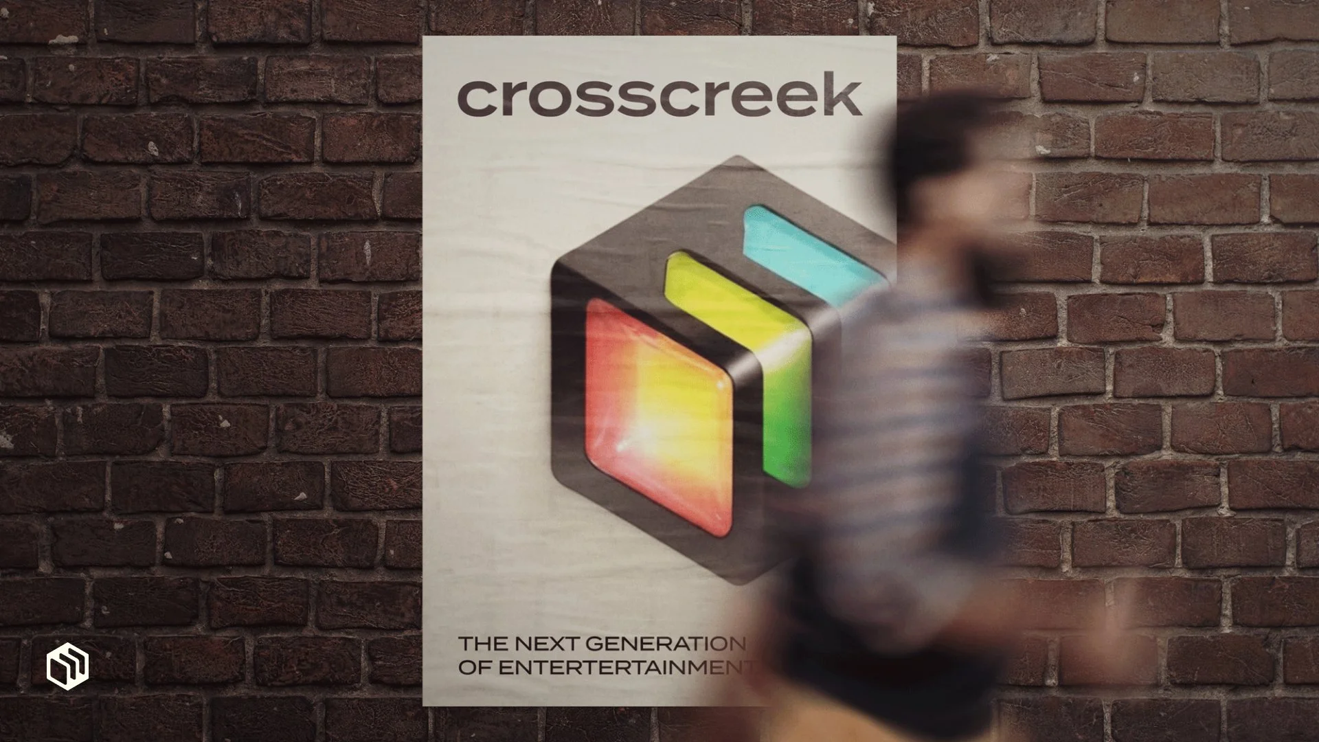
In collaboration with Cru, we developed five new logo options, each exploring a different avenue for modernization while keeping the spirit of Cross Creek Pictures intact.
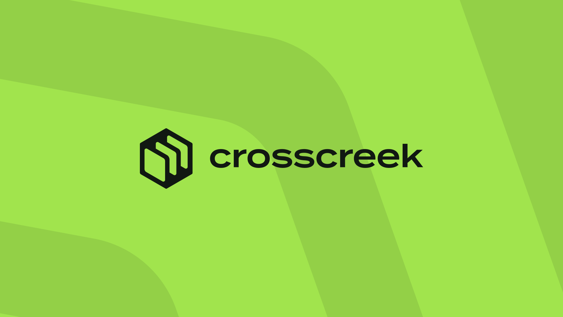
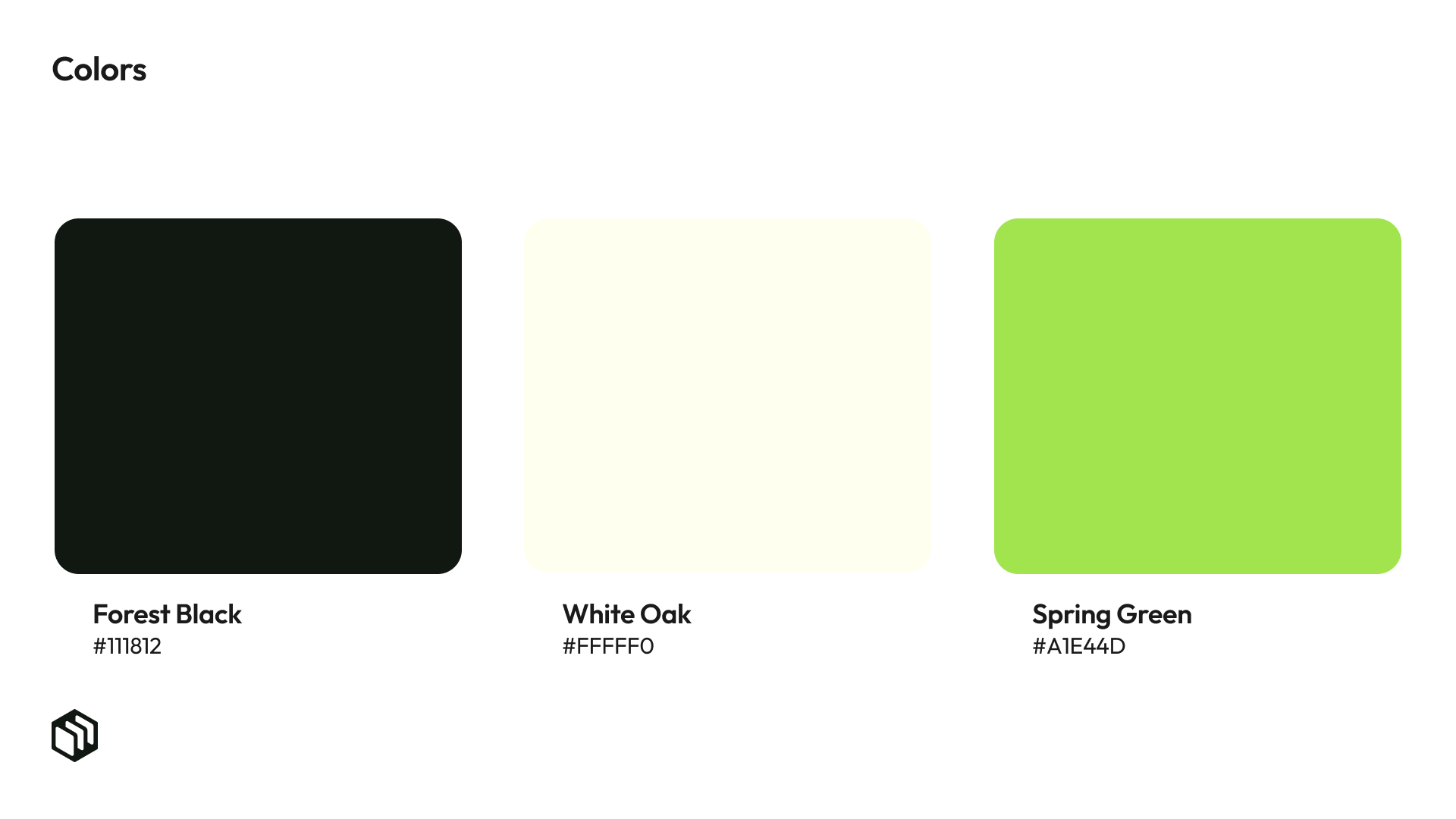
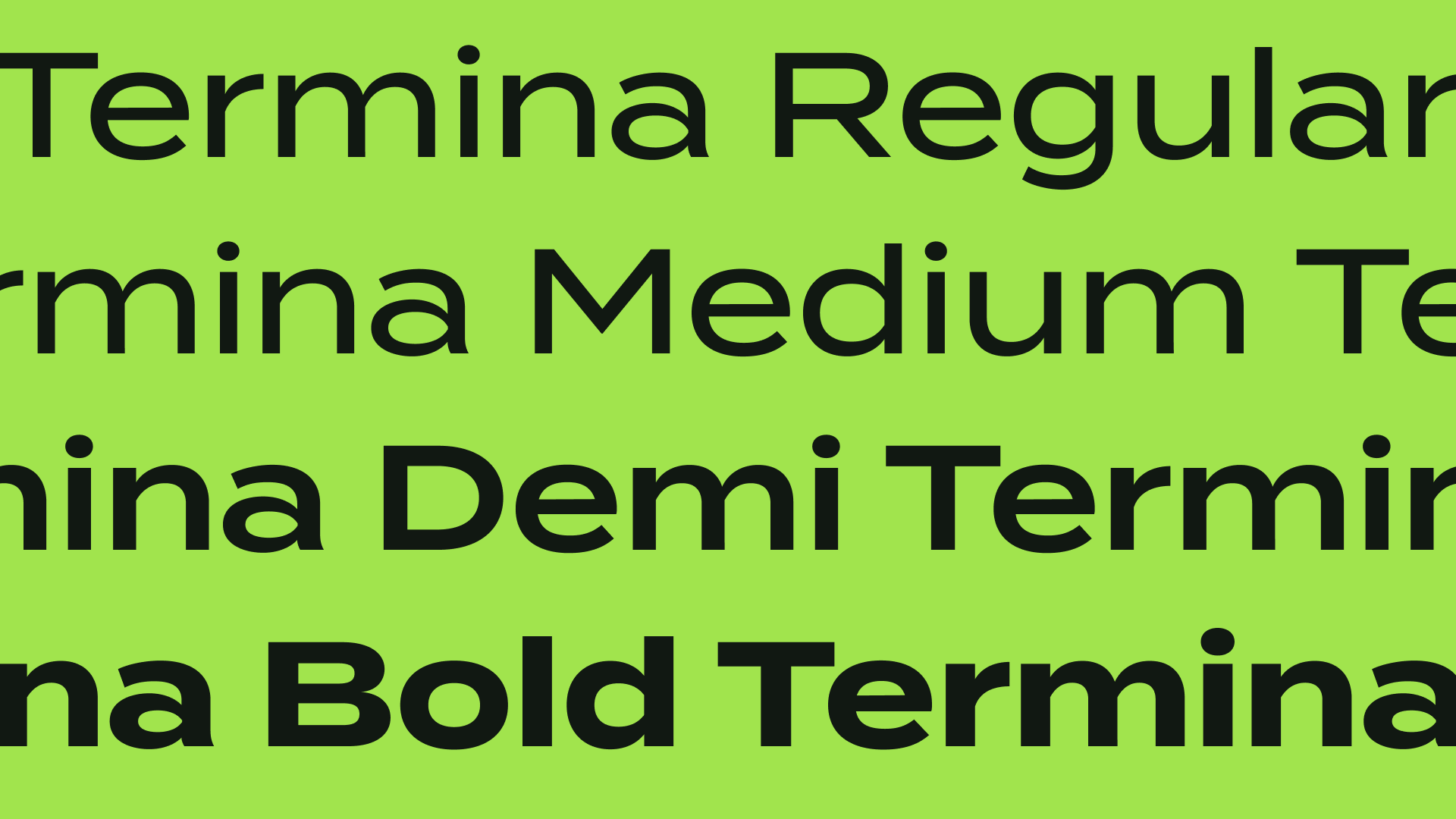
Option 1 (Green Palette)
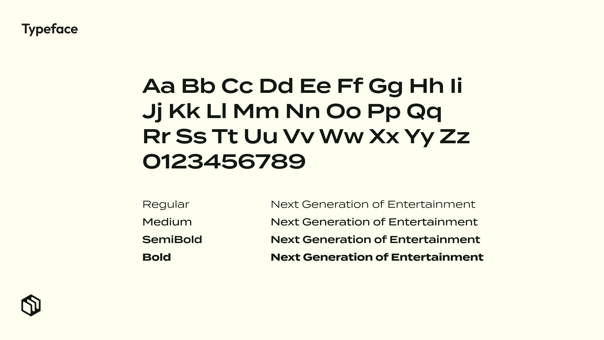
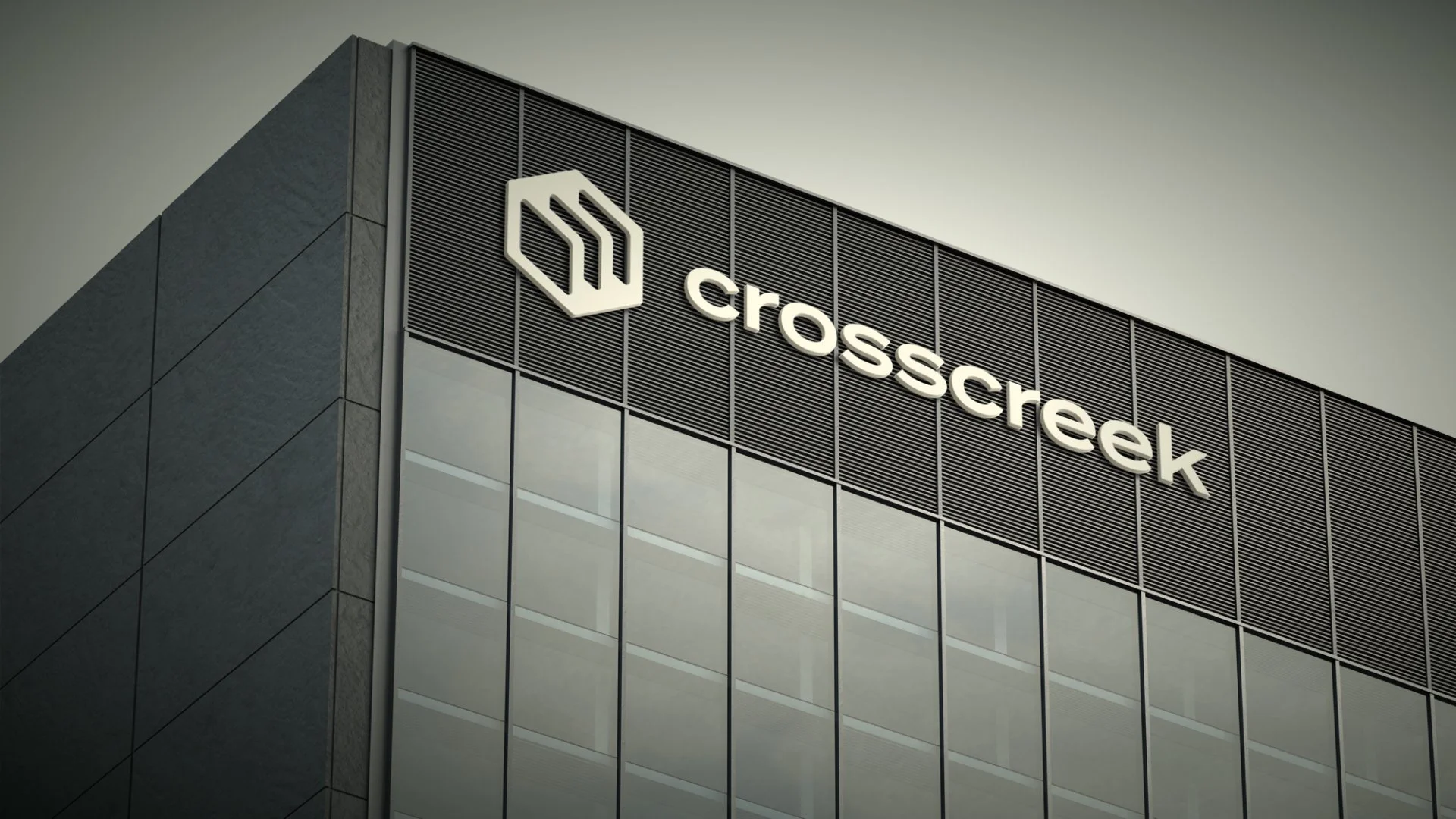
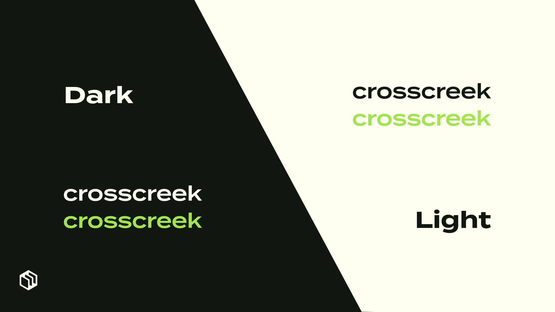
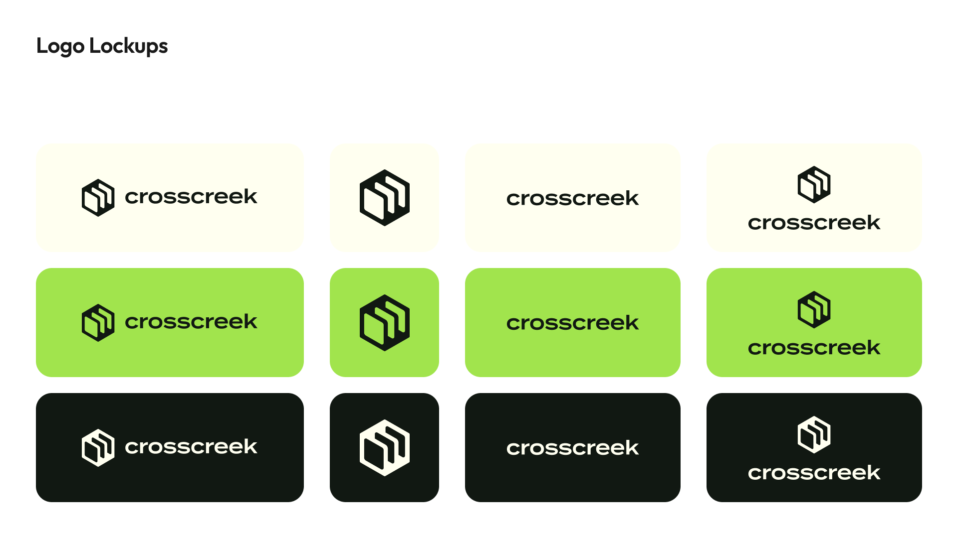
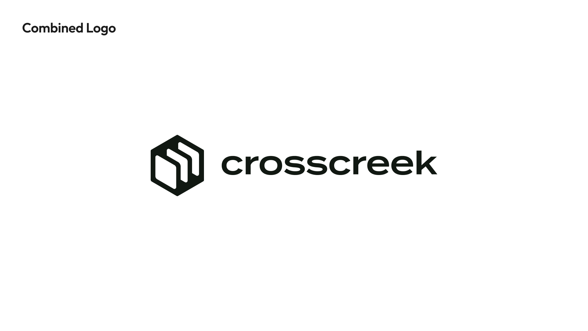
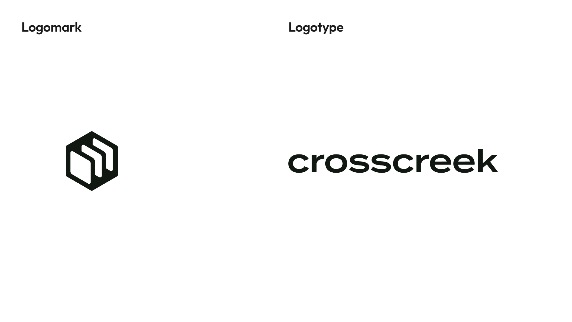
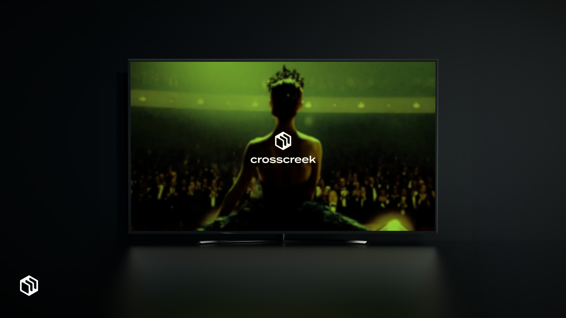
This version integrates vibrant green tones in a geometric pattern, with a hexagonal logo mark on the left and the brand name in clean, bold typography.
Strengths
The bright green palette conveys freshness and creativity, making the brand feel energetic and modern, especially appealing to younger, tech-savvy consumers.
The hexagonal shape creates an easily recognizable logo that stands out in busy digital environments, such as social media feeds or streaming platforms.
Its balance of bold color and geometric simplicity makes it accessible and memorable, making the brand feel approachable to both new and loyal audiences.

Option 2 (Orange Palette)
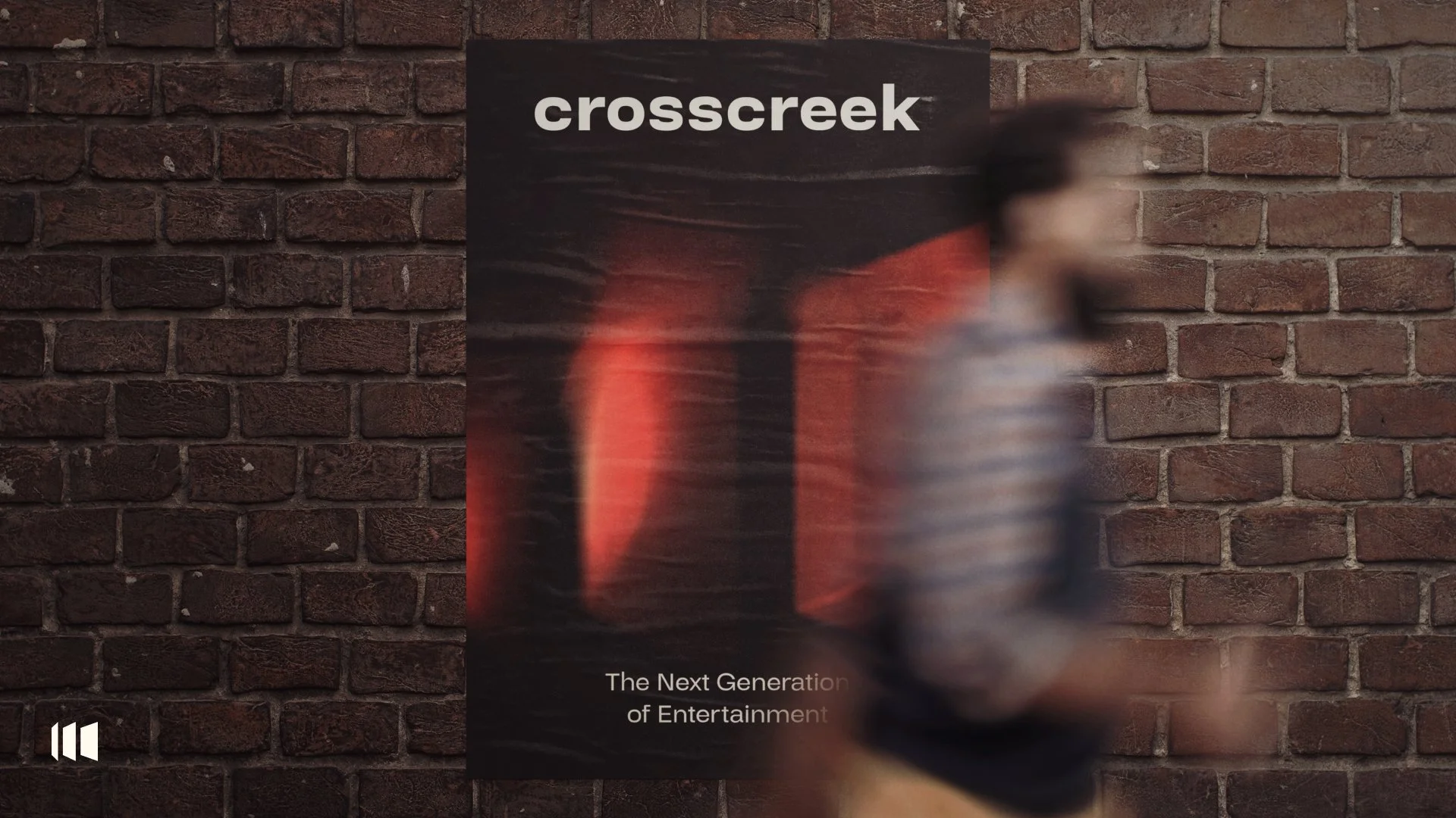
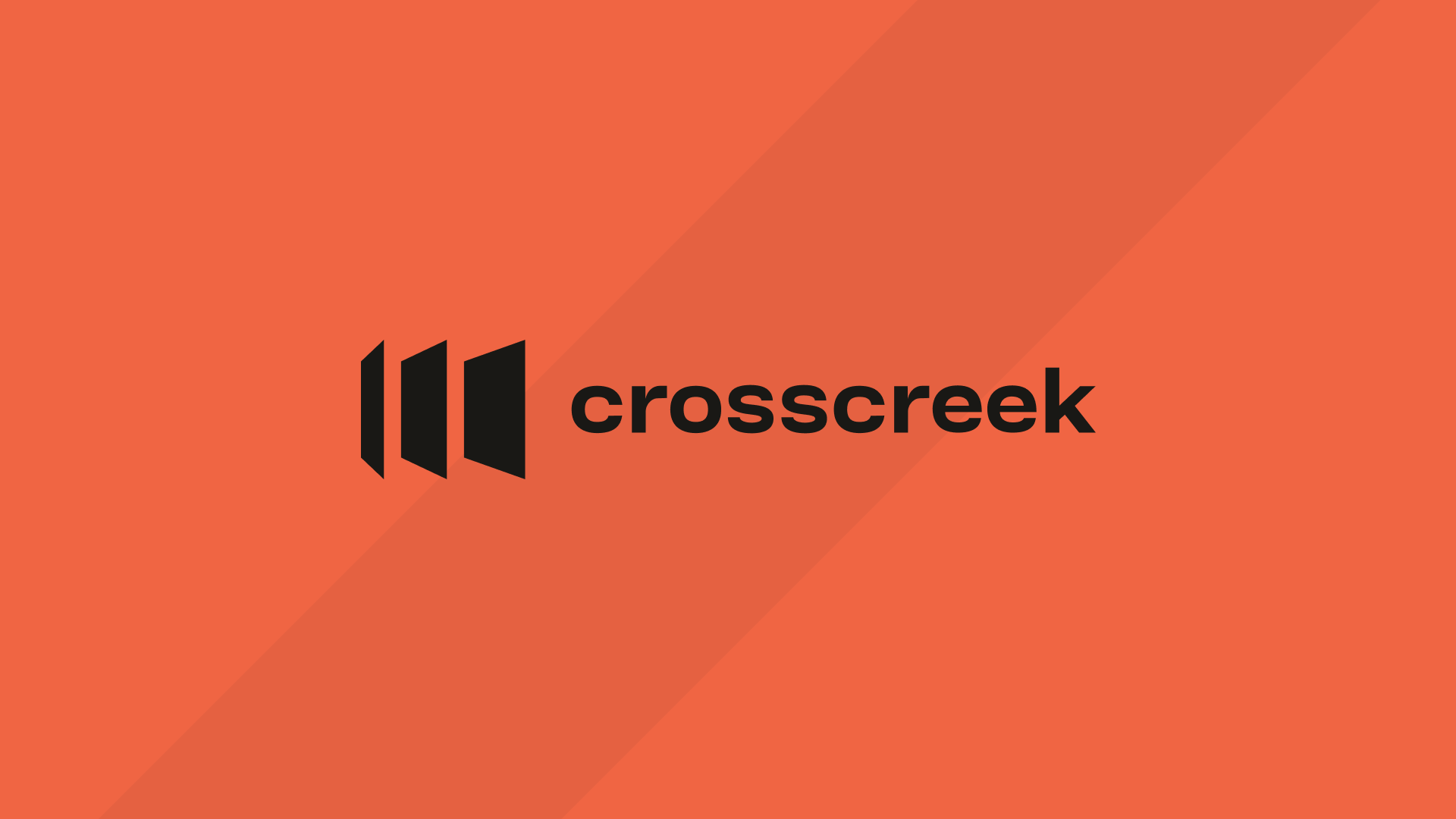
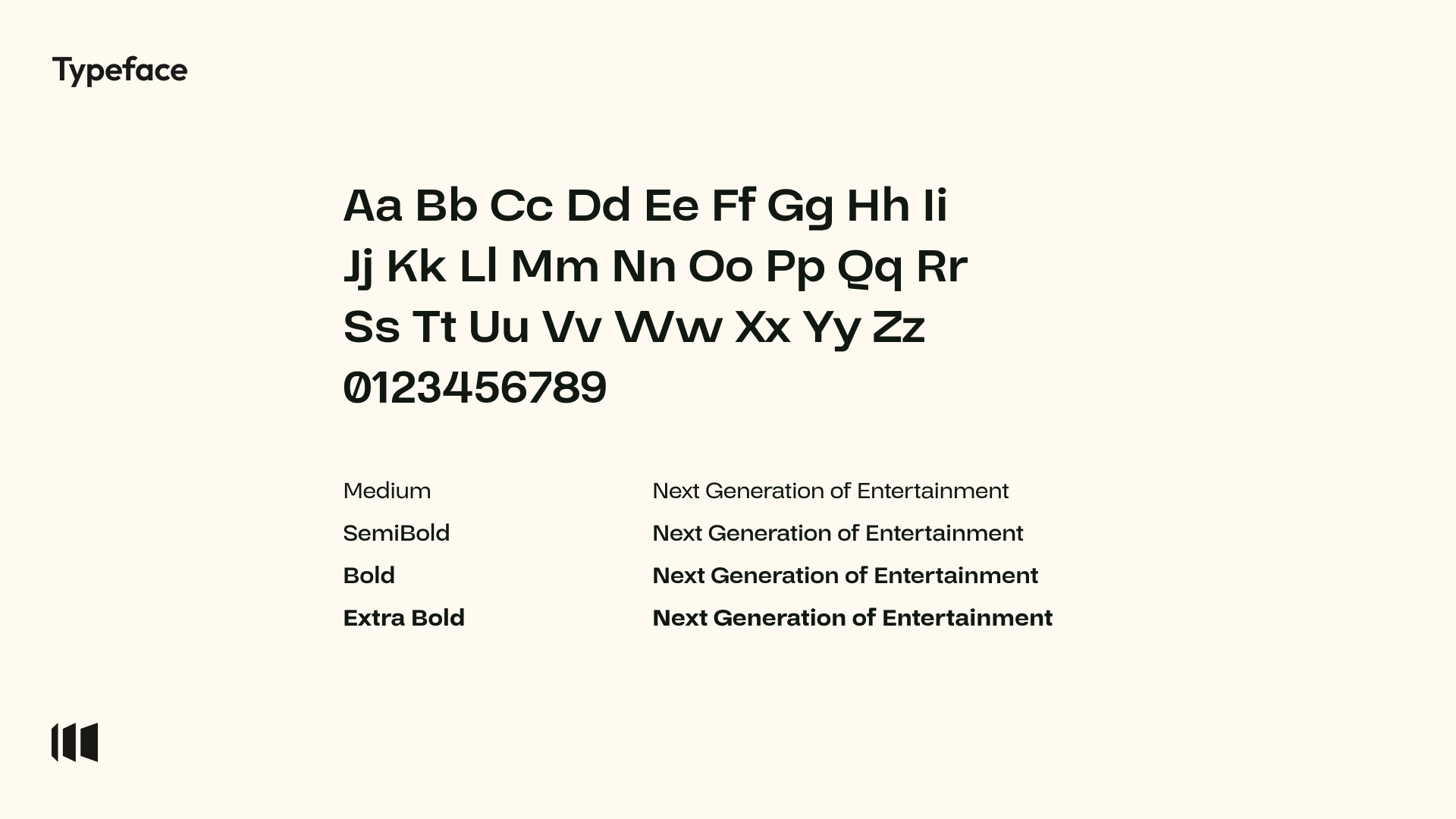
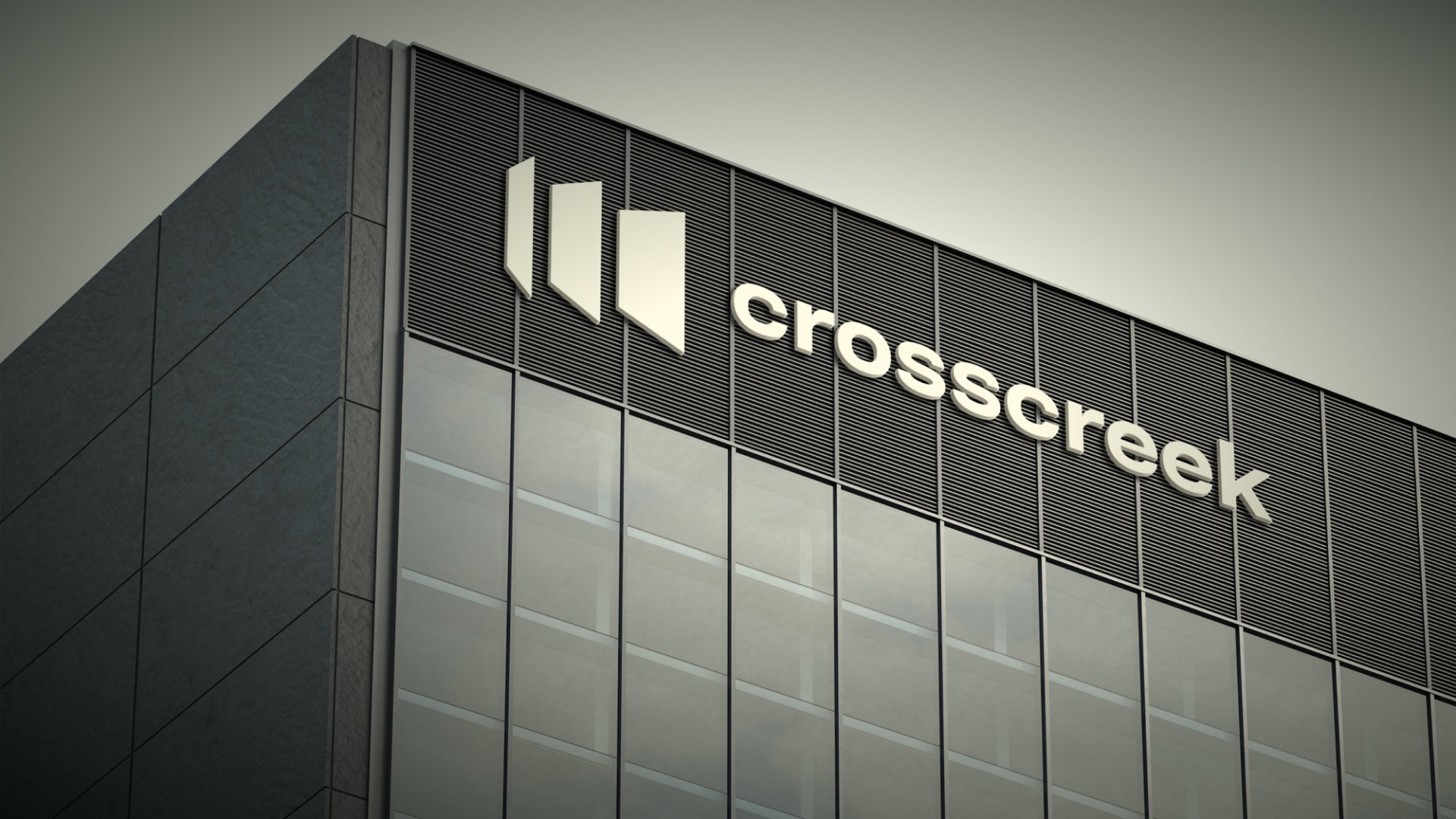
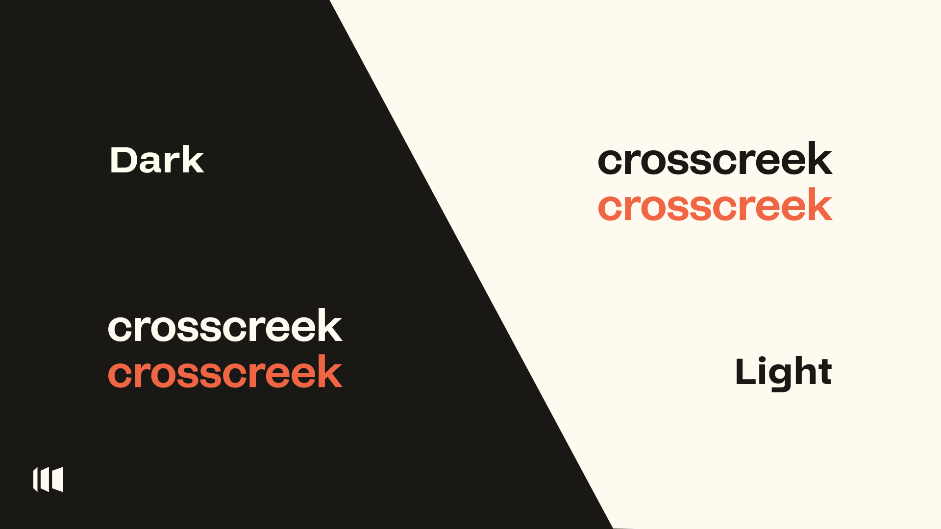
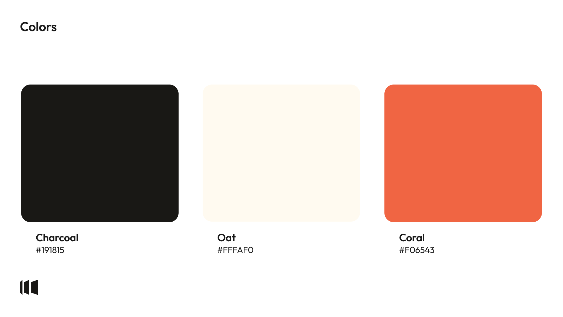
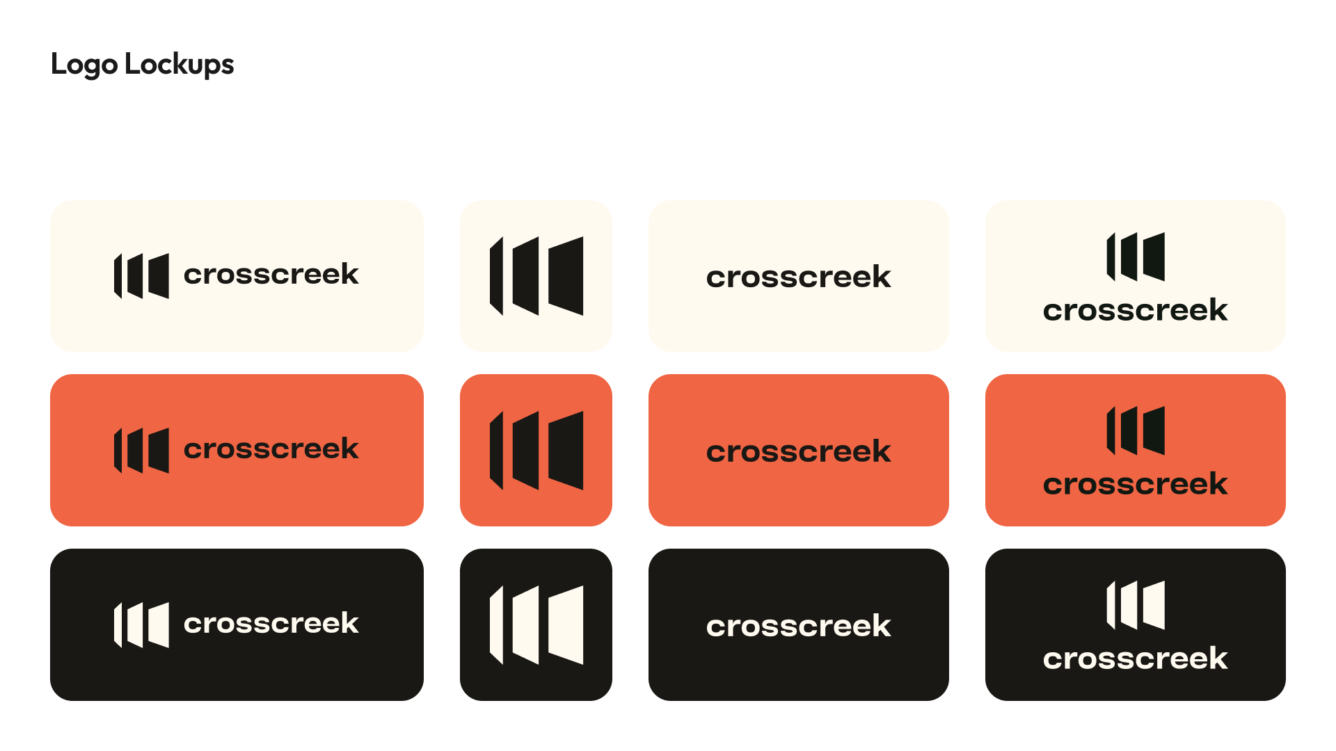
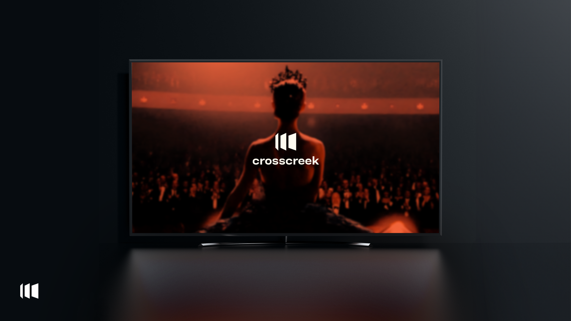
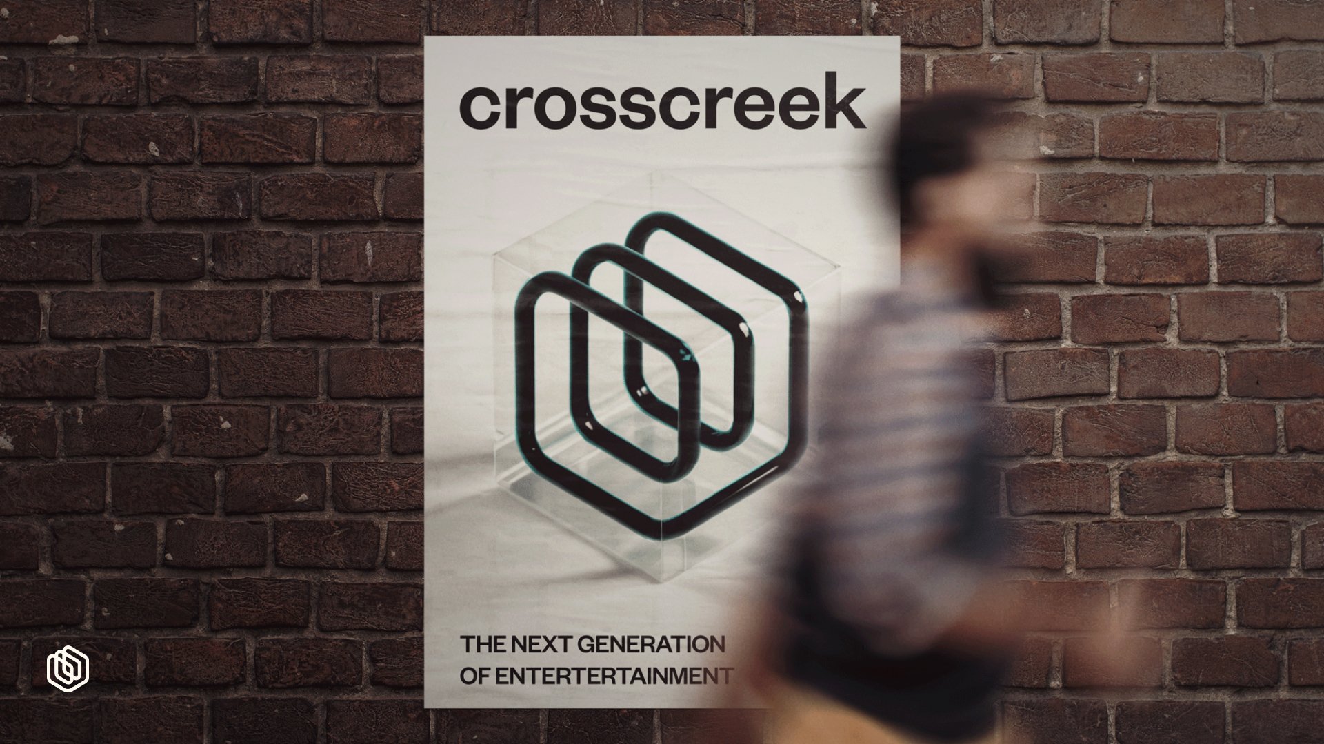
The second option explores an energetic orange color scheme, combining three forward-facing vertical bars next to a minimalist brand name.
Strengths
The bold orange palette immediately grabs attention, helping consumers associate Cross Creek with exciting, high-energy content.
The vertical bars subtly communicate progression and forward-thinking, appealing to users who are drawn to innovation and creativity in storytelling.
Its simplicity makes it easy for users to recognize and connect with the brand across various platforms, from mobile apps to cinema screens, ensuring a seamless brand experience.
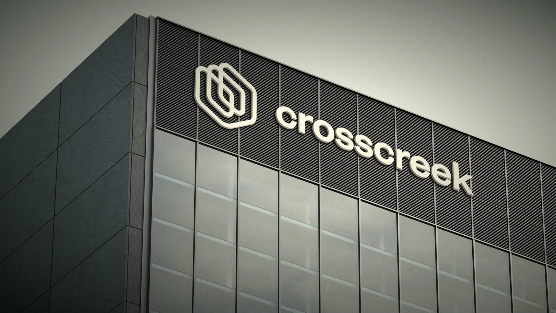
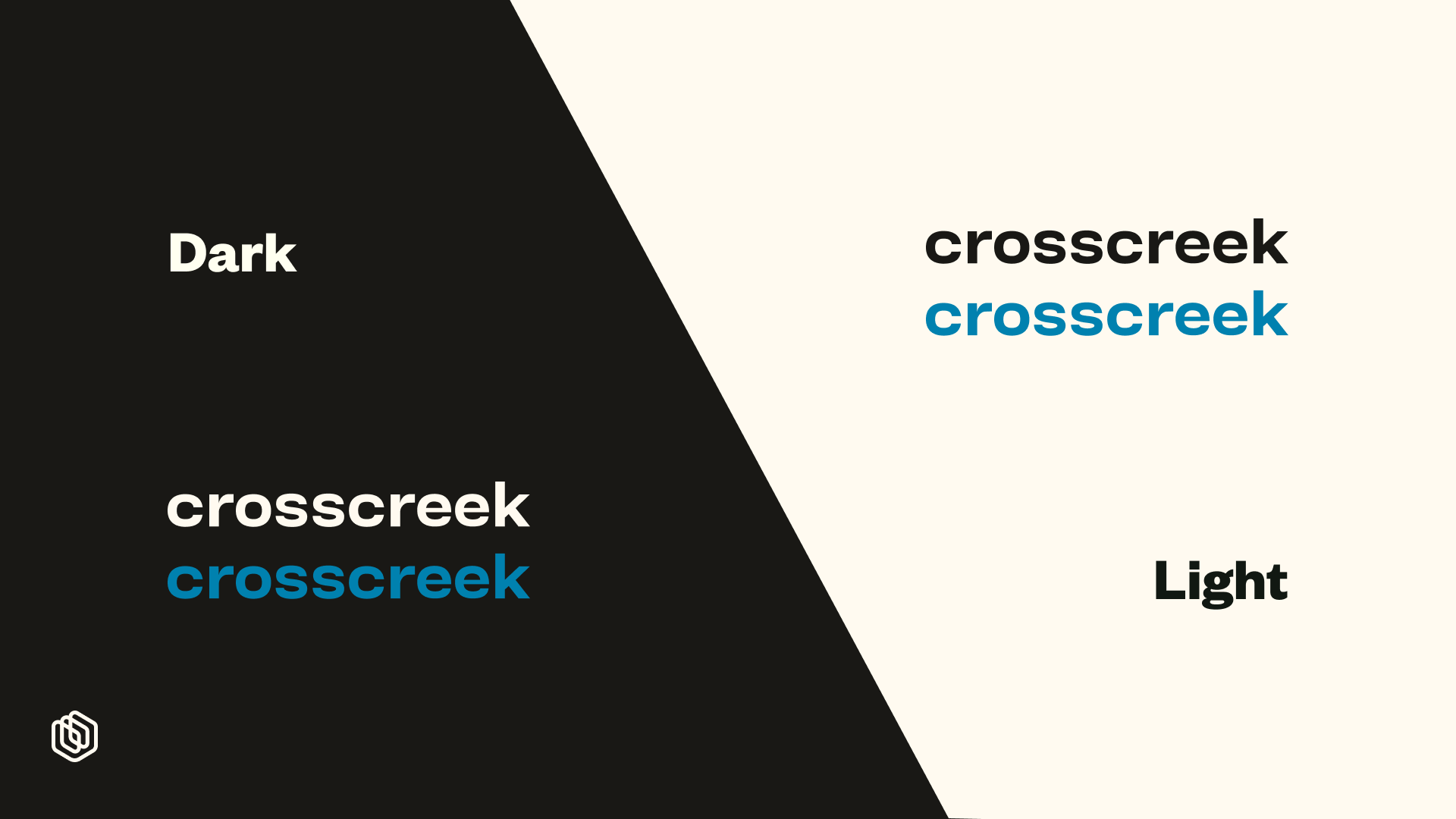
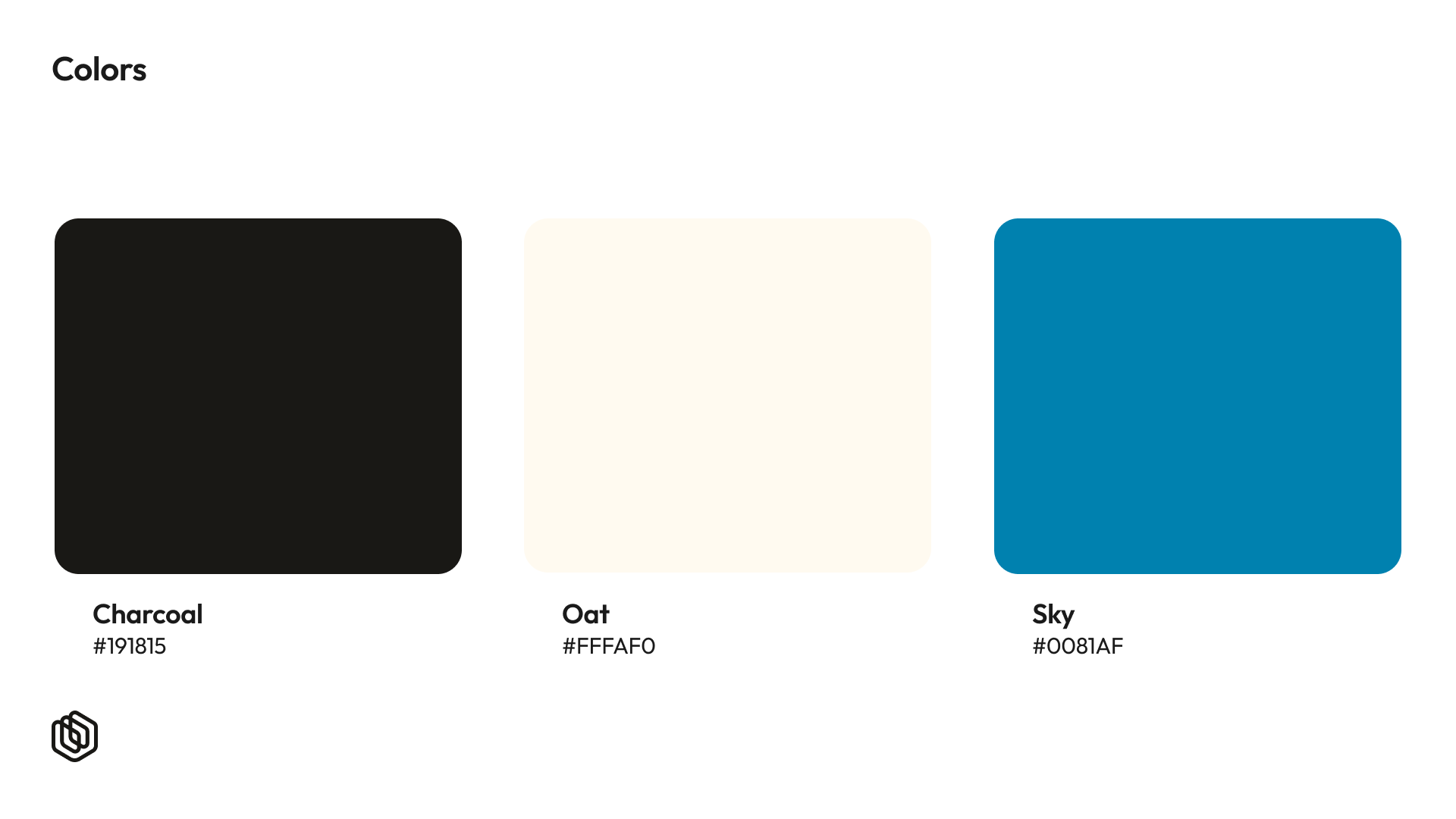
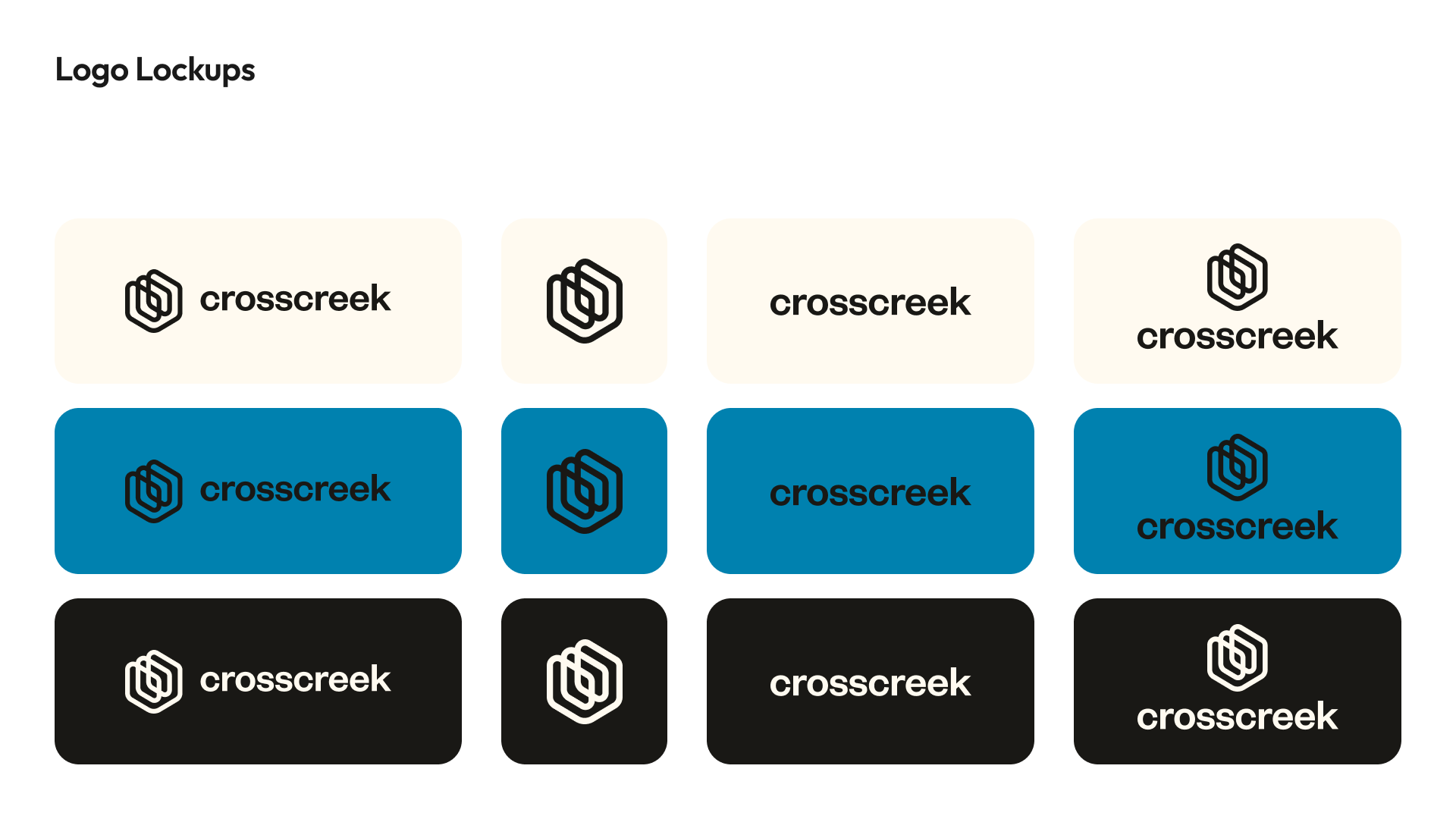
Option 3 (Blue Palette)
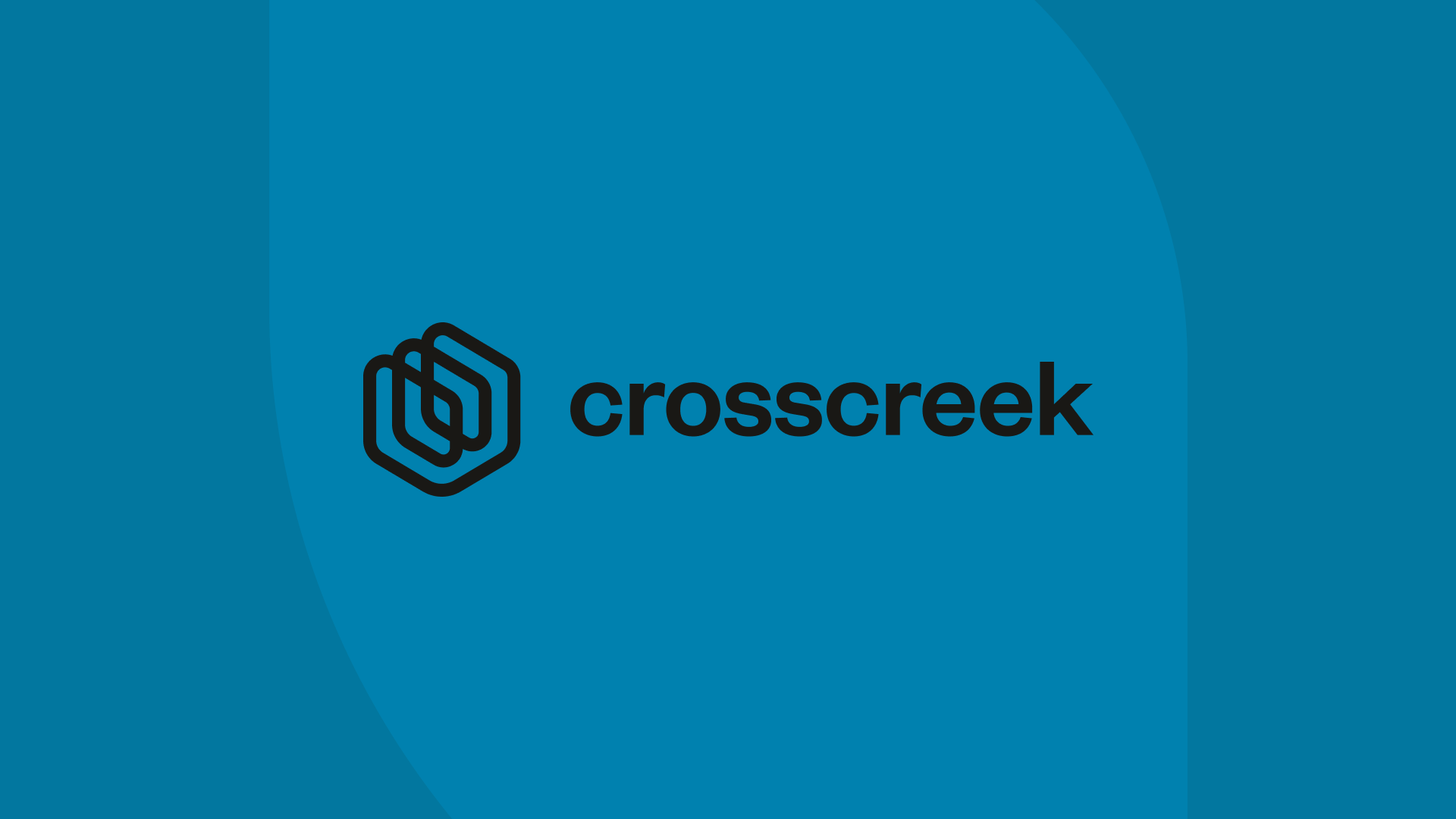
A cool blue theme in this version emphasizes professionalism and reliability. The hexagonal icon returns here but with softer edges, complementing the cooler tones.
Strengths
The calming blue conveys trust and reliability, reassuring audiences that Cross Creek is a trusted source for quality content, especially important for older, more traditional consumers.
The smooth, rounded hexagon edges make the logo feel friendly and accessible, helping consumers feel comfortable engaging with the brand across multiple platforms.
The blue color also appeals to corporate clients and partnerships, making the brand appear professional and established, enhancing user trust.

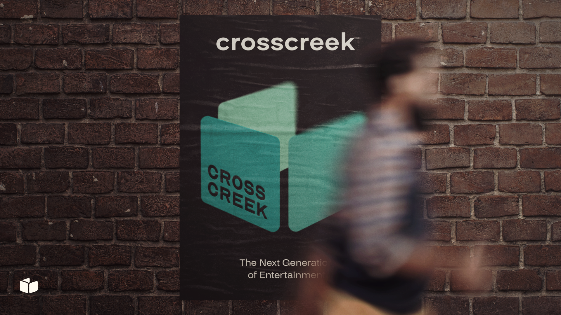
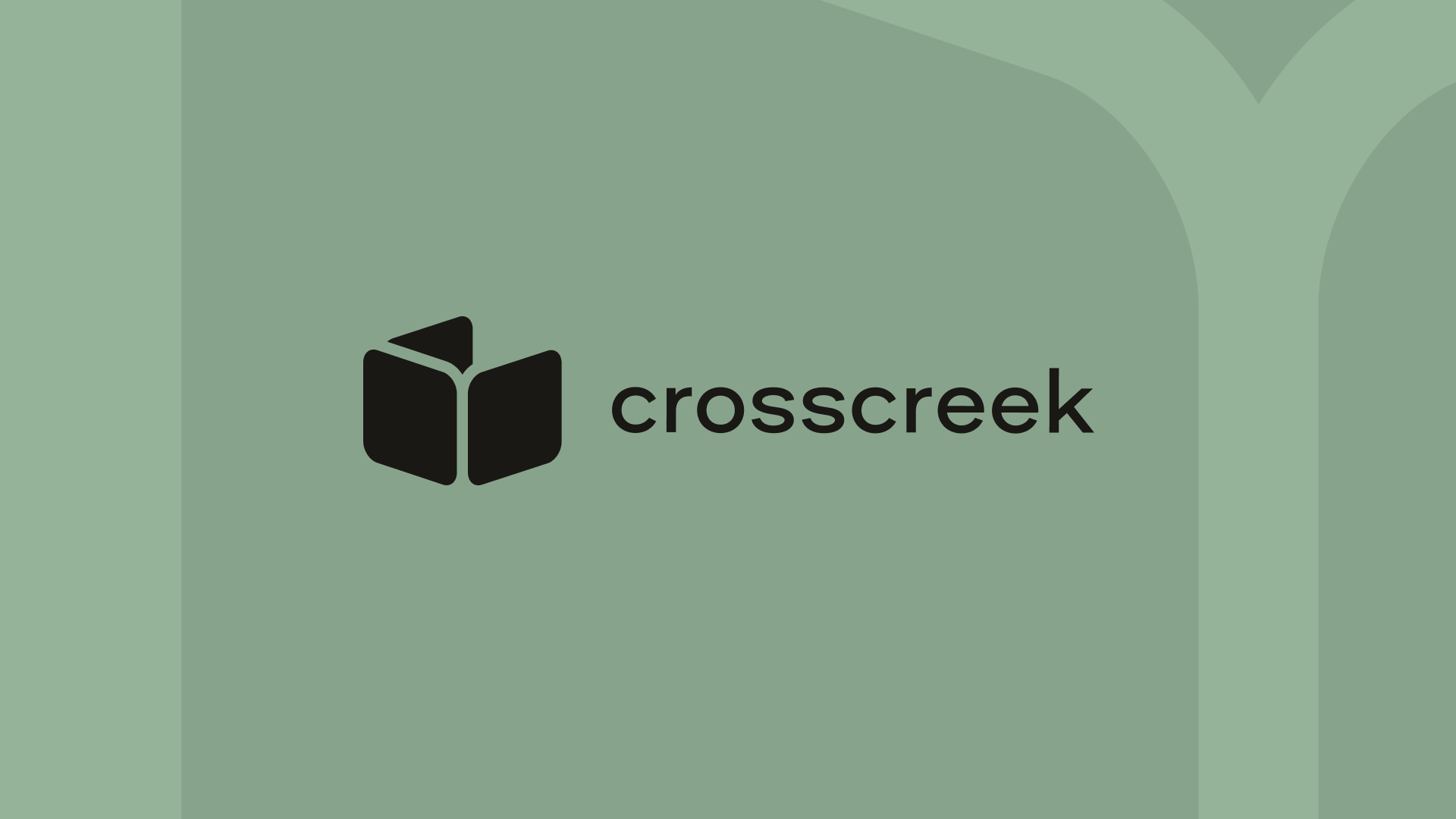
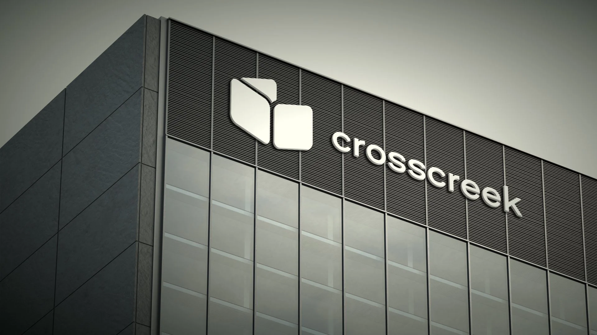
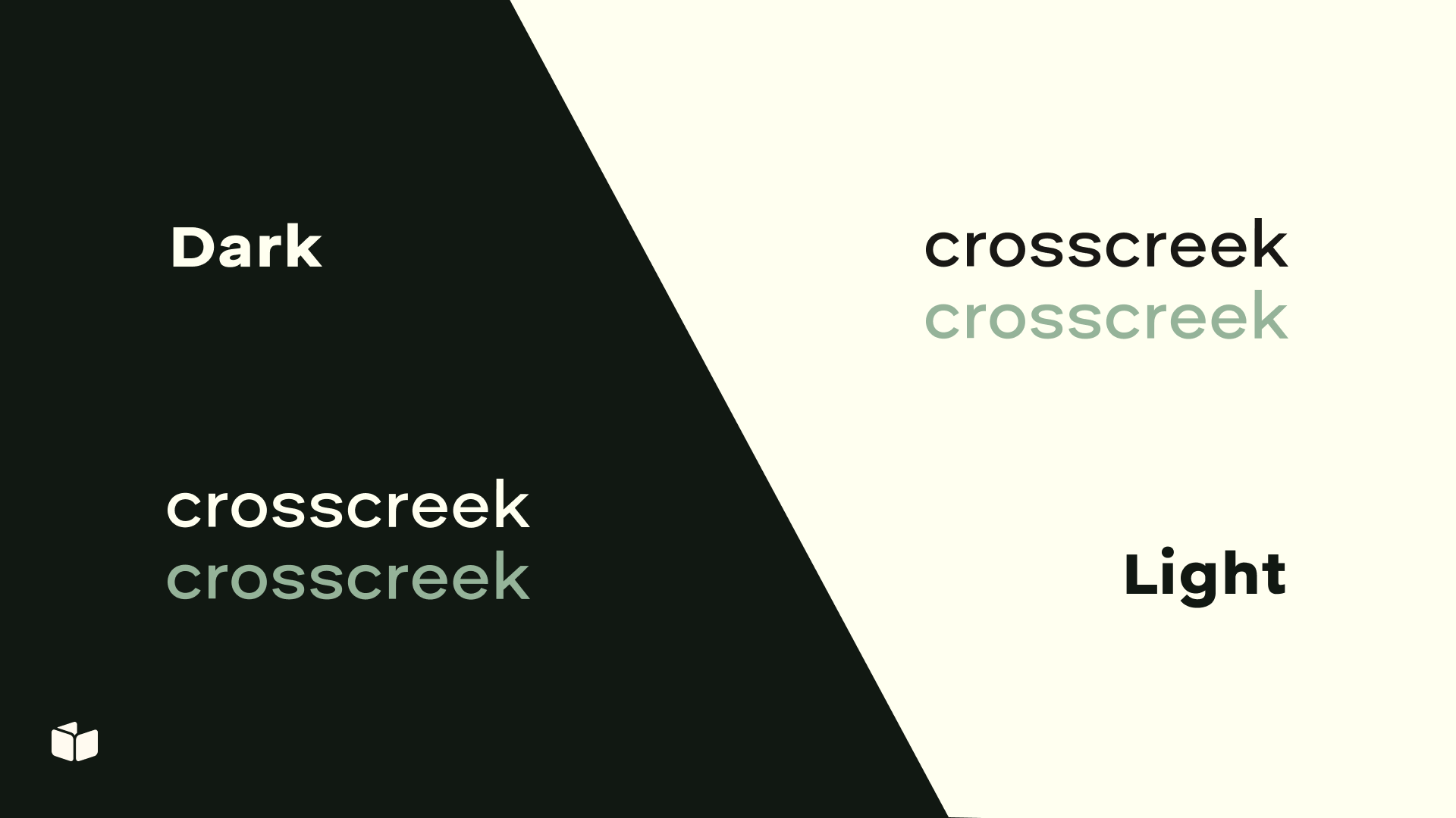
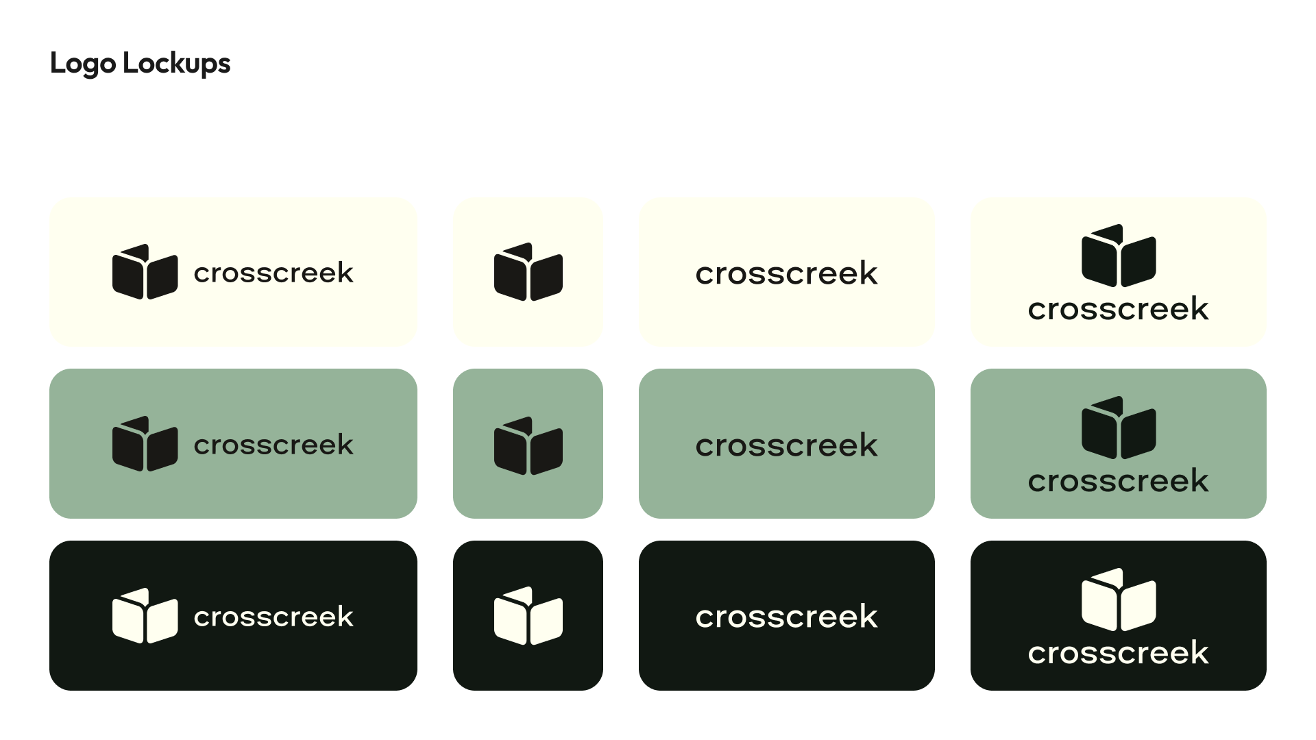
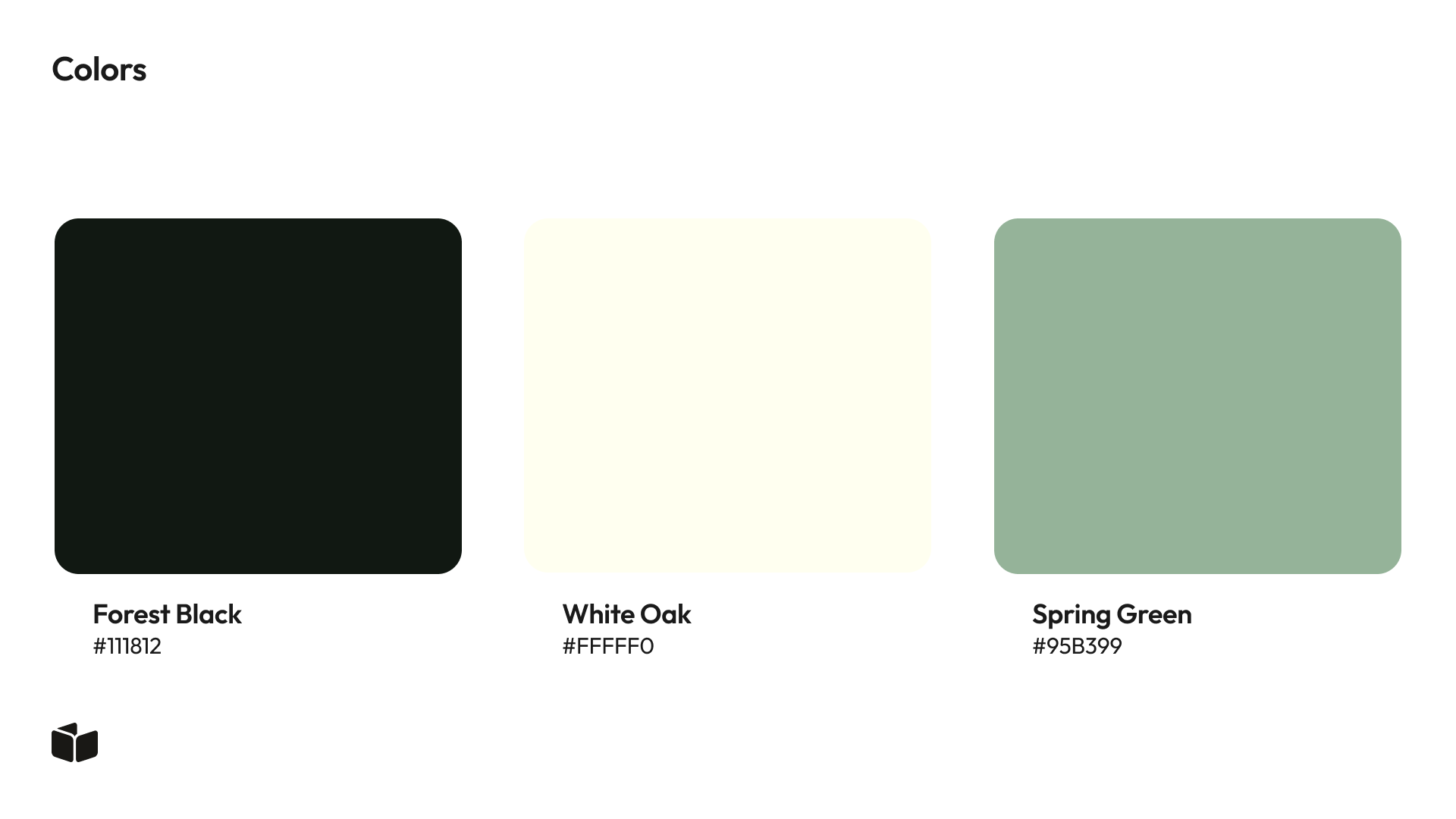
Option 4 (Muted Green Palette)
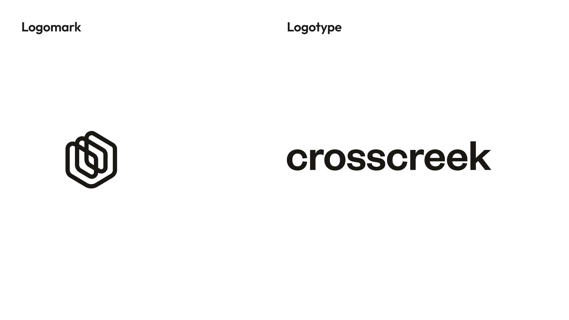
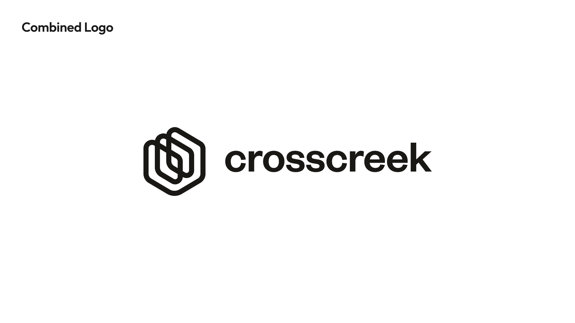
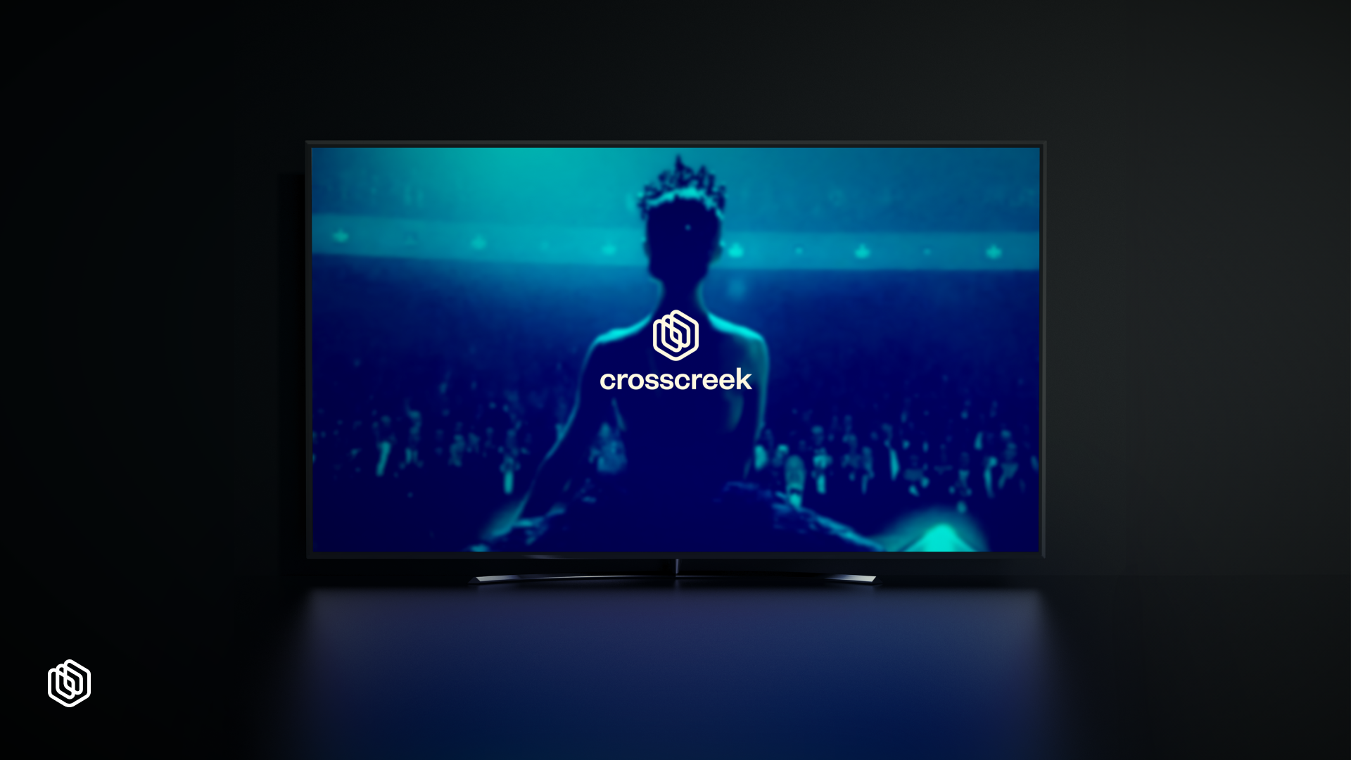
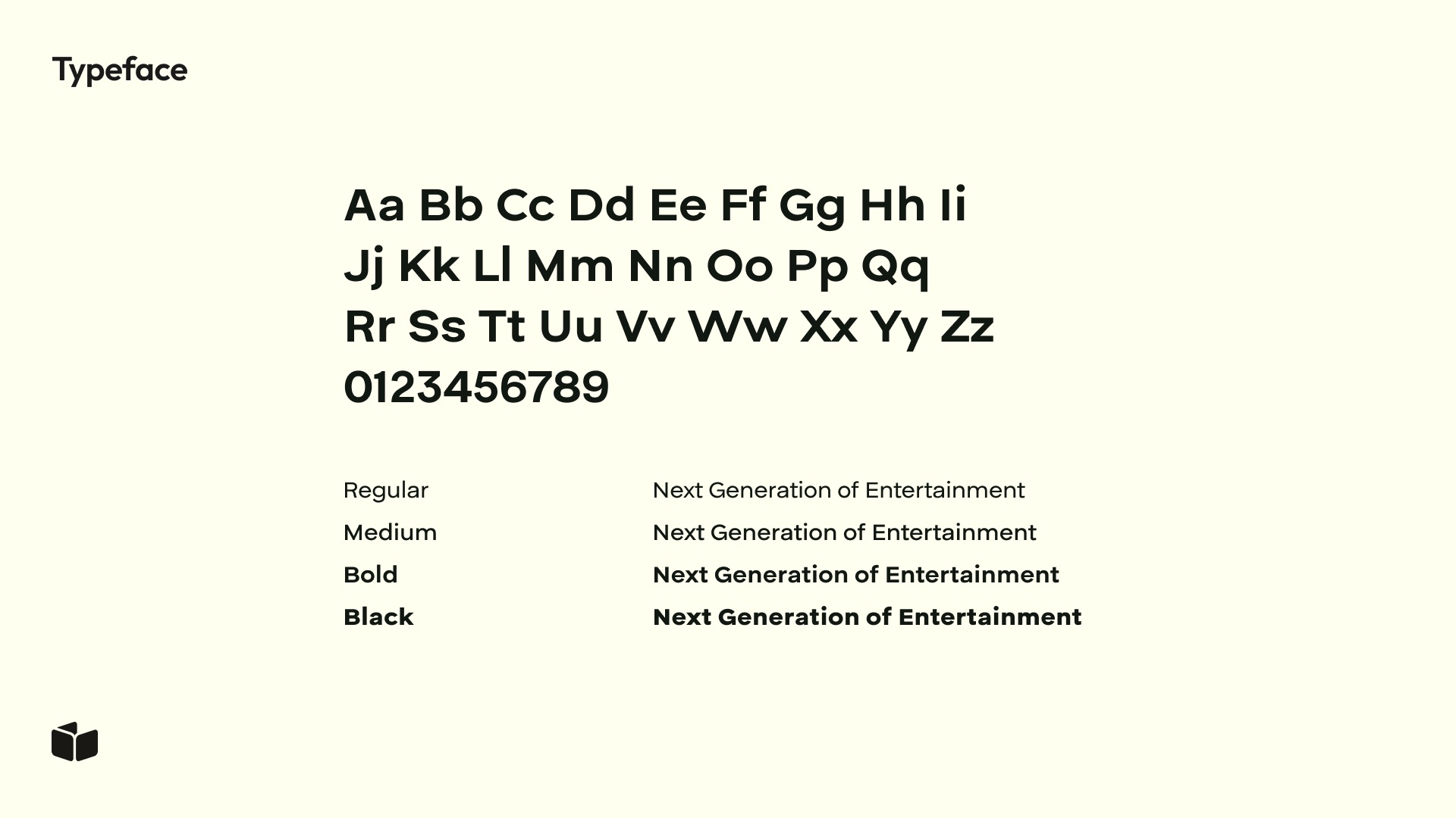
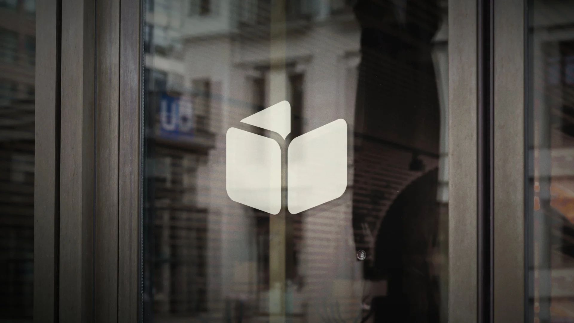
This variation takes a more subdued, muted green approach with a more abstract icon and modernized typography.
Strengths
The muted green tones provide a sense of calm and thoughtful storytelling, attracting consumers who are drawn to deeper, more meaningful content.
The abstract icon allows for flexibility in visual storytelling, giving users a fresh, modern look without overwhelming them with complex visuals.
This design appeals to consumers who appreciate subtlety and creativity, offering a sophisticated, understated look that encourages exploration of Cross Creek’s unique narratives.
Option 5 (Purple Palette)
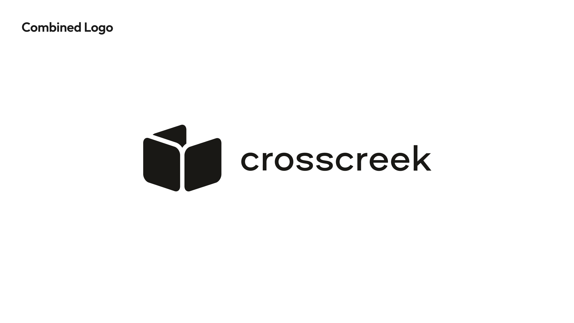
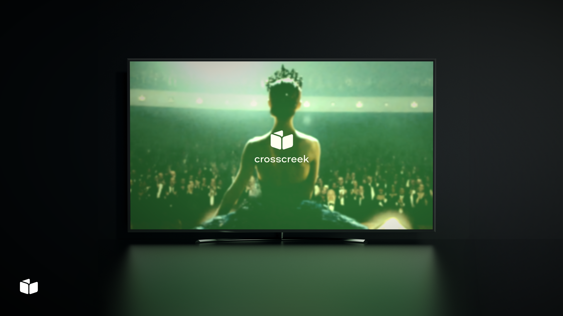
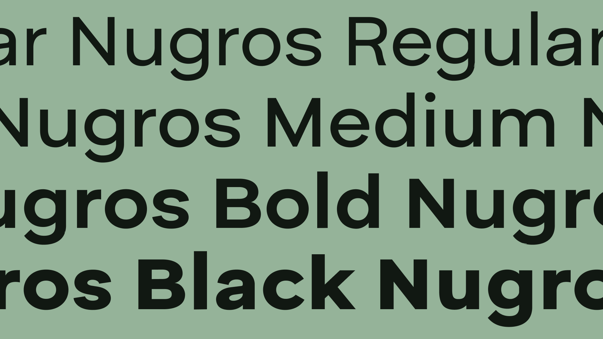
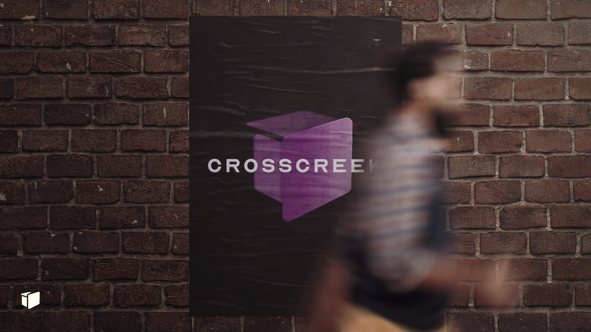
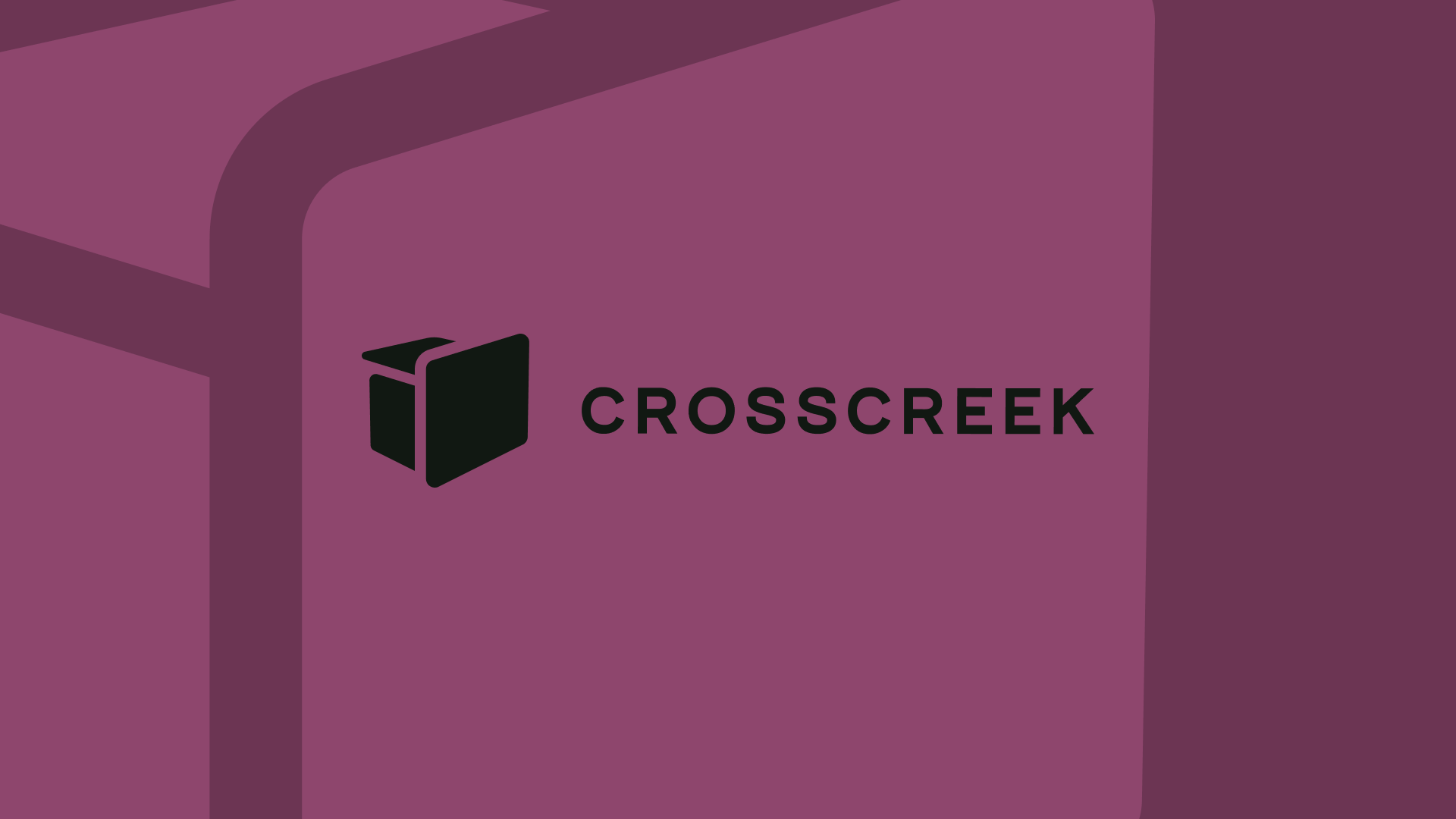
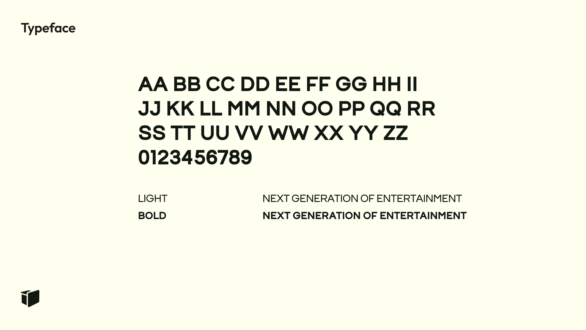
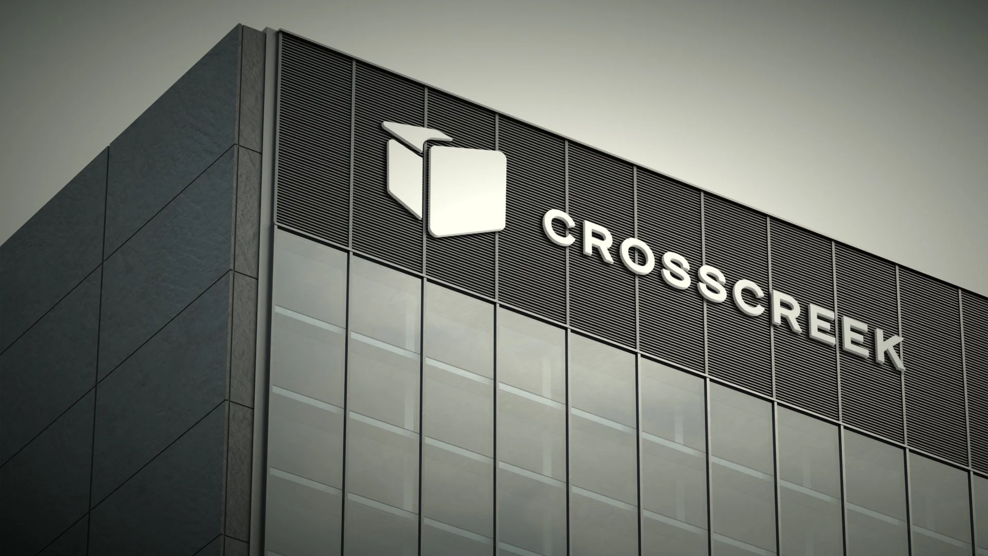
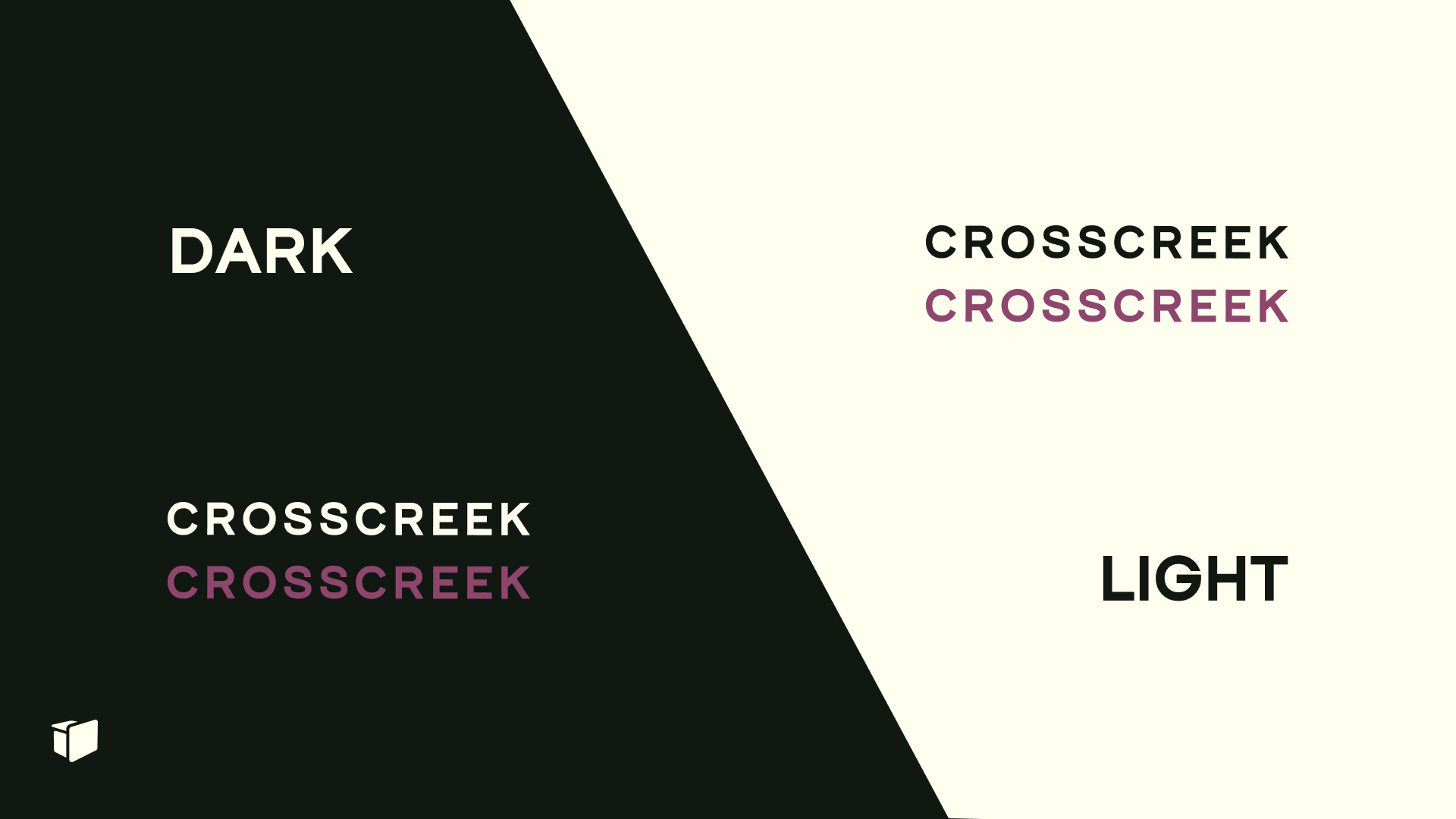
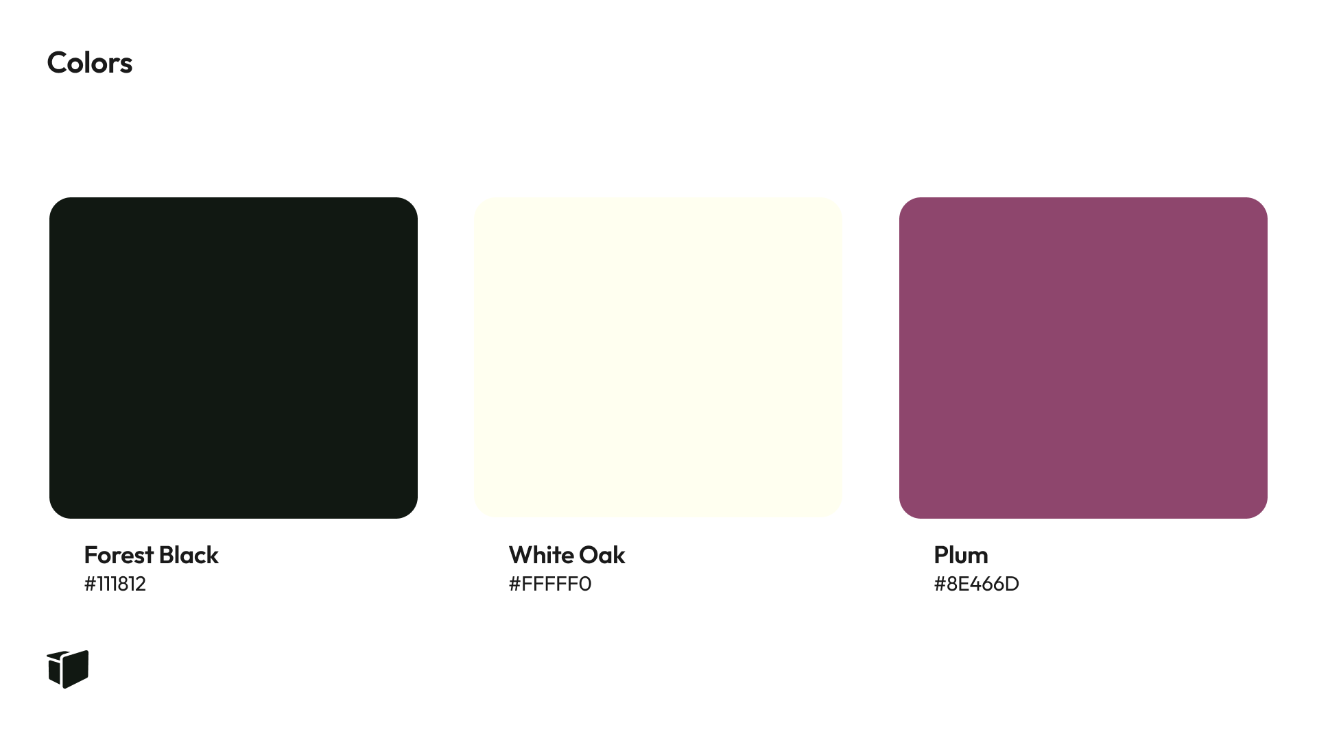
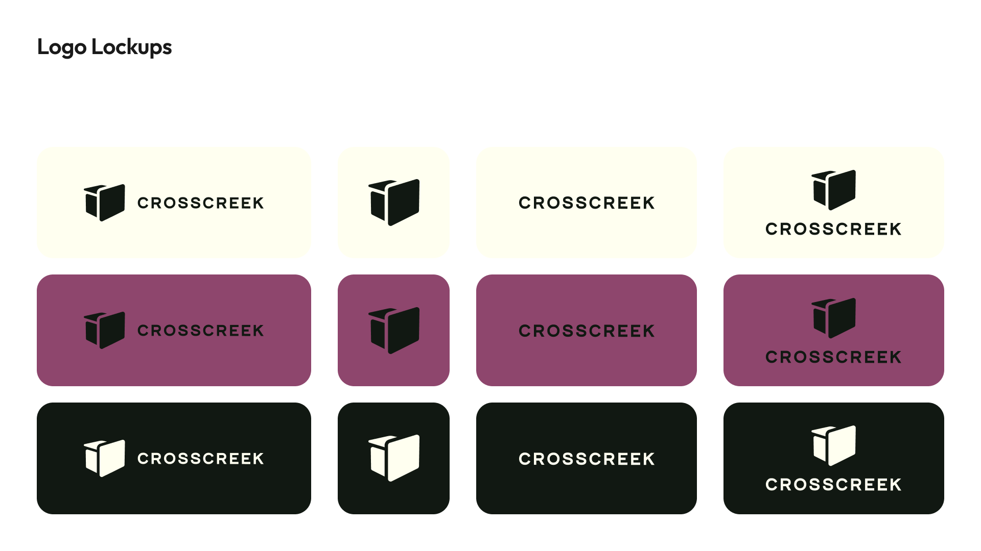
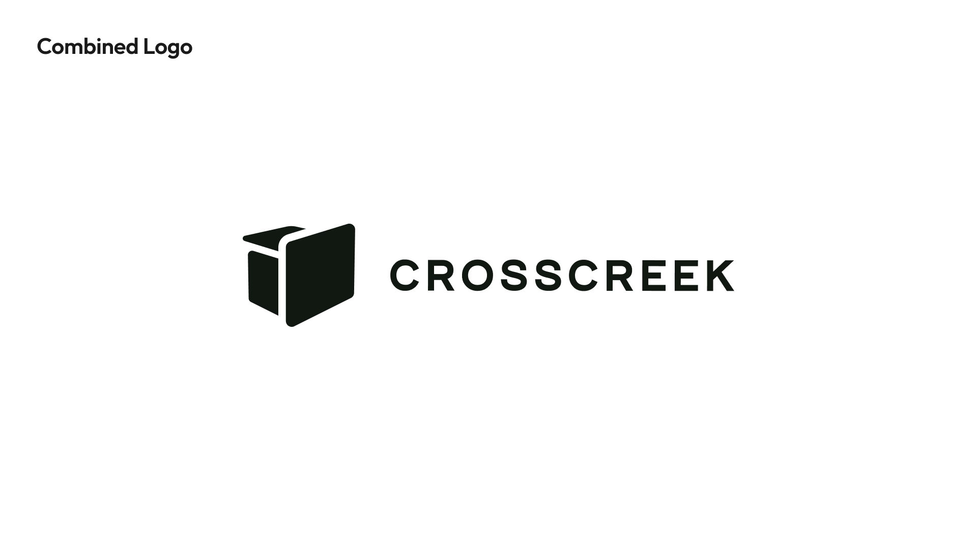
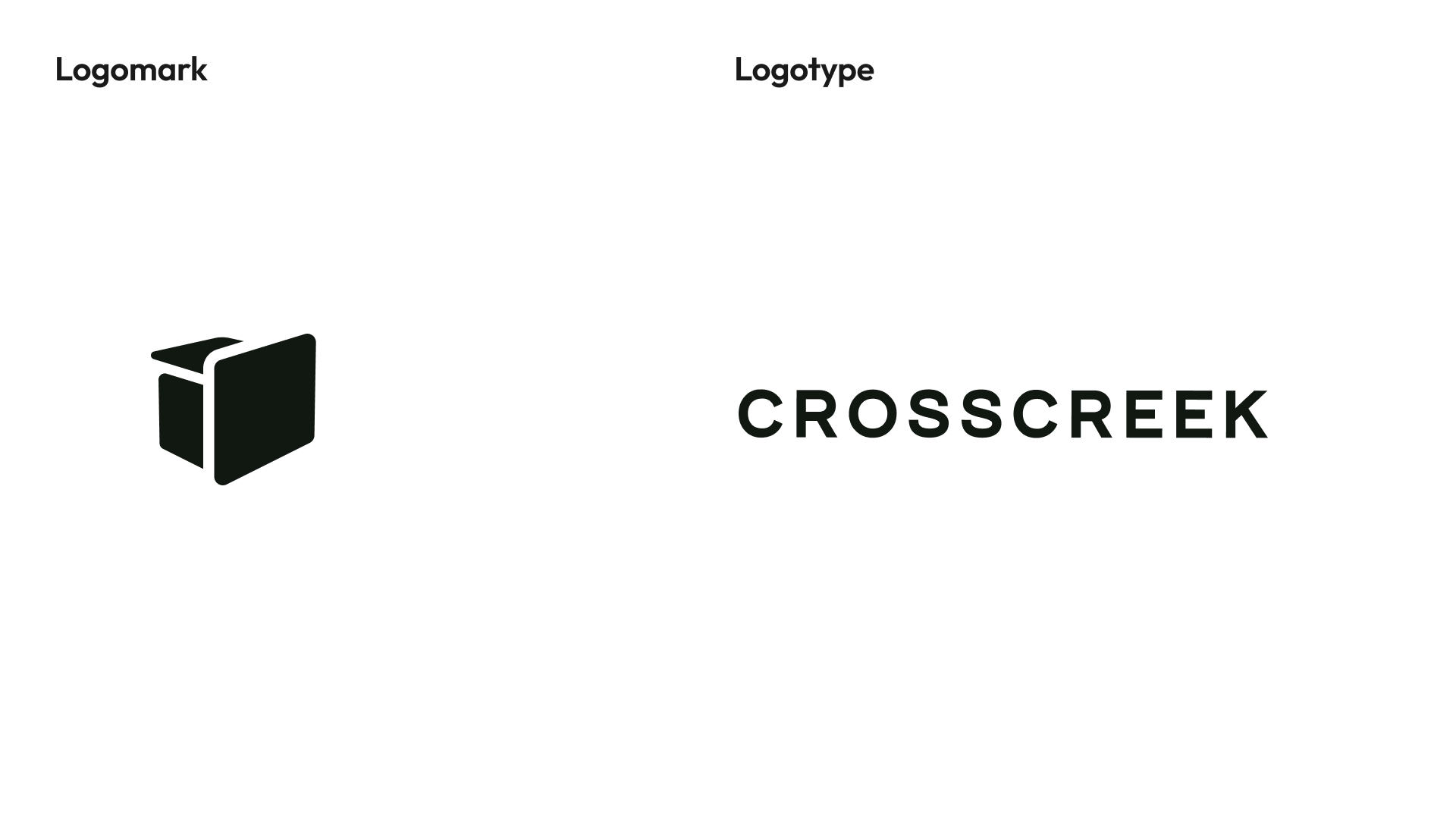
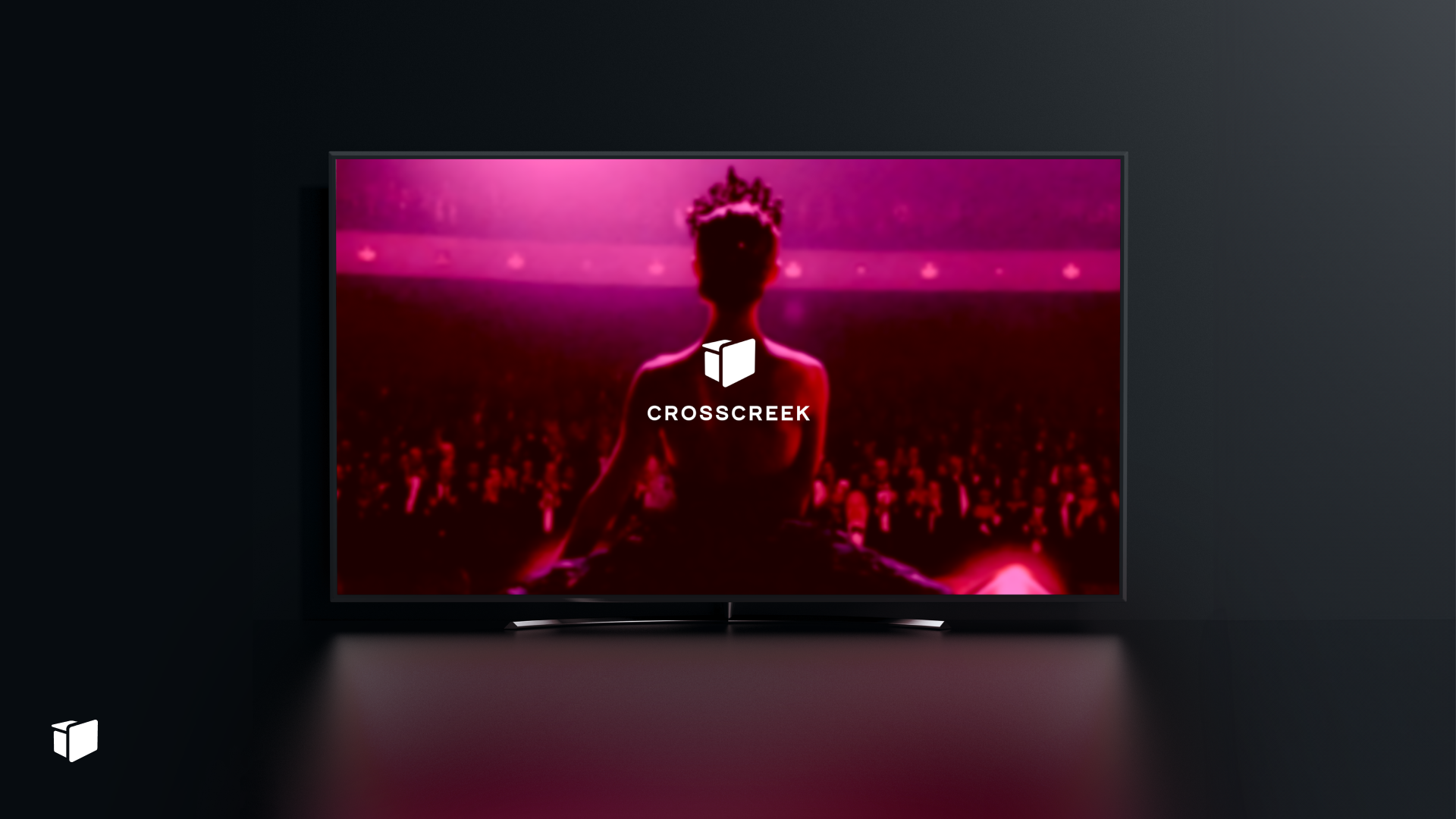
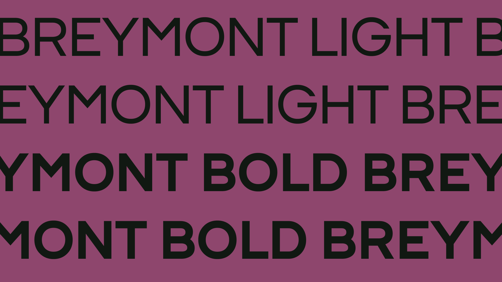
In this option, we see a vibrant purple background paired with a modernized book-like logo, suggesting storytelling and creativity, while the typography remains bold and slightly condensed.
Strengths
The rich purple tone is unique and luxurious, appealing to audiences looking for premium, artistic, and high-quality content.
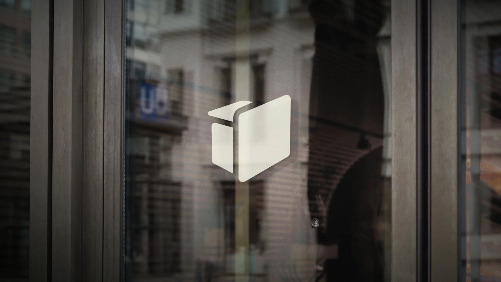
The book-like icon reinforces storytelling, creating an emotional connection with users who value compelling narratives, making the brand feel more intimate and relatable.
Its bold yet elegant design ensures it stands out in highly competitive environments like film festivals or streaming services, making it memorable for consumers with artistic tastes.
Logo Animation
As part of Cross Creek’s rebranding project, no existing animation was available for their current logo.
While they explore new logo designs, I have worked on animating their current logo to maintain consistency and brand visibility during the transition.
The animation I created uses a 3D block transition where the letters of “Cross Creek” rotate within a tunnel-like effect,
moving from dark to light tones, achieving:
Cinematic Appeal
A smooth, dramatic reveal fit for film production.Depth and Dimension
The use of light and shadows gives it a modern yet timeless feel.
This animation will be utilized until a new logo is selected, ensuring brand consistency.
Final Considerations
Each of the new logo options brings unique strengths, addressing Cross Creek’s needs to modernize its visual identity. The decision depends on whether the company aims to embrace a more innovative path or retain a classic, traditional feel in its rebranding.
Key Factors to Consider
Target Audience
Which palette and design align best with the future audience’s preferences?Digital Performance
How does each logo adapt to digital platforms, from websites to animated intros?Brand Evolution
Does the company want to project creativity and innovation, or preserve its established sense of reliability?
Next Steps
Client Feedback Session
Present options to Cross Creek for their input.Refinements
Adjust based on feedback, merging elements if necessary to find the perfect balance.Implementation Strategy
Once the final logo is chosen, develop comprehensive brand guidelines to ensure smooth implementation across all media platforms.